
In this project, you will learn to create a burning candle with flame with the help of HTML and CSS.
HTML Code: burning-candle.html
<!DOCTYPE html>
<html>
<head>
     <title>CSS Project - Burning Candle</title>
</head>
 <body>
     <div id="flame">
     </div>
     <div id="flamestick"></div>
     <div id="candle">
     </div>
 </body>
 </html>
CSS Code: burning-candle.html
Now we will insert the following CSS code in the <head> section of the HTML page – burning-candle.html.
<style>
body {
background-color:black;
}
#flame{
background-image:linear-gradient(to top,red,orange,beige);
width: 80px;
height: 200px;
position:absolute;
top:100px;
left:500px;
border-radius:75%;
box-shadow: 10px 10px 60px 20px #cccc00;
animation-name: bigflame;
animation-duration: 4s;
animation-delay:2s;
animation-iteration-count:infinite;
}
@keyframes bigflame{
0% {
height: 200px;
width: 80px;
}
20% {
height: 210px;
width: 90px;
}
30% {
height: 230px;
width: 90px;
}
50% {
height: 250px;
width: 95px;
}
70% {
height: 230px;
width: 90px;
}
100% {
height: 210px;
width: 90px;
}
}
#candle {
width:150px;
height:250px;
background-image:linear-gradient(to top,black,gray,lightgray,orange);
position:absolute;
top:325px;
left:470px;
}
#flamestick{
width:10px;
height:40px;
background:black;
position:absolute;
top:290px;
left:540px;
opacity:90%;
}
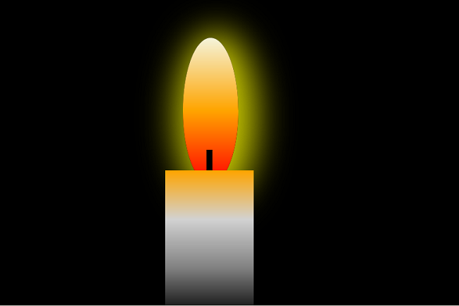
</style>The entire page will look like the following.
Whole Program Code
<!DOCTYPE html>
<html>
<head>
     <title>Lamp - Diya</title>
     <style>
     body {
         background-color:black;
     }
     #flame{

         background-image:linear-gradient(to top,red,orange,beige);
         width: 80px;
         height: 200px;
         position:absolute;
         top:100px;
         left:500px;
         border-radius:75%;
         box-shadow: 10px 10px 60px 20px #cccc00;
         animation-name: bigflame;
         animation-duration: 4s;
         animation-delay:2s;
         animation-iteration-count:infinite;
       }
 @keyframes bigflame{
  0% {
   height: 200px;
   width: 80px;
 }
 20% {
   height: 210px;
   width: 90px;
 }
  30% {
   height: 230px;
   width: 90px;
 }
 50% {
   height: 250px;
   width: 95px;
}
 70% {
   height: 230px;
   width: 90px;
 }
 100% {
   height: 210px;
   width: 90px;
 }

 }
 #candle {

     width:150px;
	 height:250px;
	 background-image:linear-gradient(to top,black,gray,lightgray,orange);
	 position:absolute;
	 top:325px;
	 left:470px;
}
#flamestick{

    width:10px;
	height:40px;
	background:black;
	position:absolute;
	top:290px;
	left:540px;
	opacity:90%;
}
</style>
 </head>
 <body>
         <div id="flame">
         </div>
         <div id="flamestick"></div>
         <div id="candle">
         </div>
 </body>
 </html>
Output : burning-candle.html

