The CSS position property is not popular today, because there are excellent and efficient ways to do layouts in HTML. But, its still worth learning as many websites do use them to design layouts. It is mostly used with website design is of fixed width, that is, you already know the width of your web pages – the fixed width.
The position property applied to HTML elements. Once set, you can position the element anywhere on the page – top, right, left and bottom. The element is taken out of normal flow and shifted to the new position. Now, before we get started, you need to understand the HTML normal flow also known as flow layout.
HTML flow layout
There are two kinds of elements that dictate the flow of HTML layout – inline and block. A block type element takes up the entire width of the container( width of the webpage) and inline element only take width of the content, not more than that unless you modify it with CSS.
Consider paragraph element <p> and header element <h1> in the following; the width is equal to the width of the HTML body.

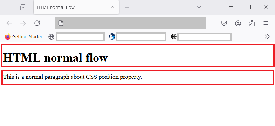
You notice that two block elements have taken the entire width of the container and does not allow any other element. Any new element must start in a new row or next line. Similarly, inline element takes just the width of the content. So, we can have many inline elements in a single line.
Consider another example, here is a paragraph element with one bold inline text.

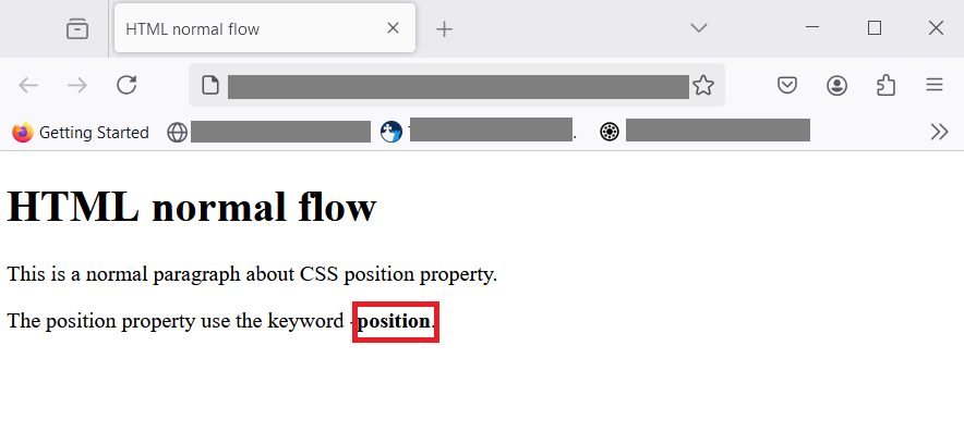
With inline element, it just takes enough space for the content. In the image above, word position is a bold text using inline element <strong>position</strong>. Instead of taking whole line ,like paragraph element, it only takes space enough to hold the word – position. This is normal flow in HTML.
CSS position property
If the CSS position property is set on an HTML element , then we can specify its position anywhere on the page. There are five different position values for this property.
- static
- relative
- fixed
- absolute
- sticky
I will explain each one of them with examples. You could use these examples to practice and understand it later. Let’s begin.
position: static;
By default, HTML flow is static. The normal flow itself is static and when you specify the top, right, left and bottom values, there is no effect on the element.
For example, let use a <div> element and set its position to static. Here is code.
<!DOCTYPE html>
<html>
 <head>
   <meta charset ="UTF-*">
   <title>HTML position - static</title>
 </head>
 <body>
   <h1>position: static</h1>
   <div>This element is static.</div>
 </body>
</html>
When you see the output in browser.

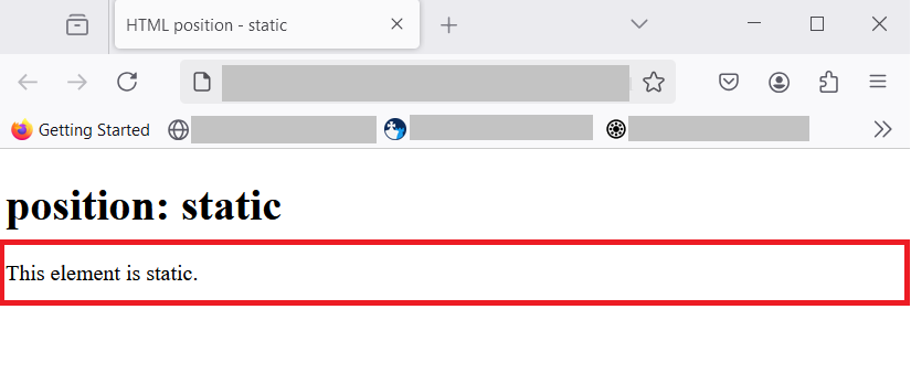
You can see from the figure above, that position is static and it does not make any change in the position. The <div> element is a block element, it takes the full width of the browser. That is normal flow in HTML. It is another way of saying “do nothing” to the element.
position: relative;
The relative position is a position relative to normal flow position. If an element is displayed in it’s normal position, you can shift it’s position to a new one, just by adjusting – top , bottom, left and right. You are allowed to set two or move values to position the element anywhere on the document.
Now before I show you, how relative position works, you must understand two important concepts – stacking context and the z-index.
Stacking context and z-index
When we set relative property on an HTML element , sometimes one element appears above or below another element to the user viewing at the browser. This is called the stacking context. It appears that there is a z-coordinate other than (x,y)-coordinate system of CSS. This third coordinate is called z-index in CSS.

<!DOCTYPE html>
<html>
<head>
<meta charset ="UTF-*">
<title>Stacking context</title>
<style>
/*style information */
div{
display: flex;
justify-content: center;
align-items: center;
font-weight: bold;
}
.parent {
background-color: red;
width: 300px;
height: 300px;
}
.child{
background-color: lightblue;
width: 200px;
height: 200px;
position: relative;
left:100px;
}
</style>
</head>
<body>
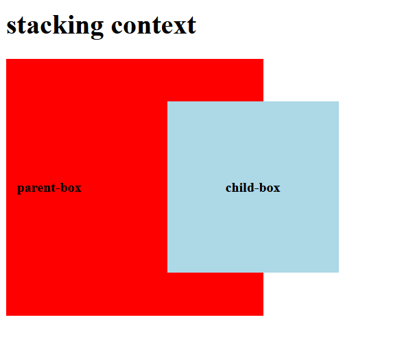
<h1>stacking context</h1>
<div class="parent">
<p>parent-box</p>
<div class="child">
<p>child-box</p>
</div>
</div>
</body>
</html>The stacking context happen according to rendering order of the elements if you have two or move elements on the page. It can also happen with or without z-index value. With z-index , you can control which element get preference and show on top of other elements. For now, just remember this basic concepts.
How does relative positioning works
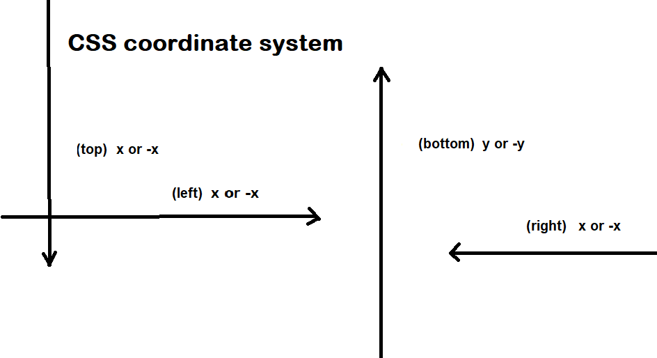
Usually , CSS display HTML elements in 2 dimensional space using a coordinate system (x, y) on the view- port (visible area inside browser). Here x is horizontal offset from the original position and y is vertical offset from the original position. To understand it better, see the image below.

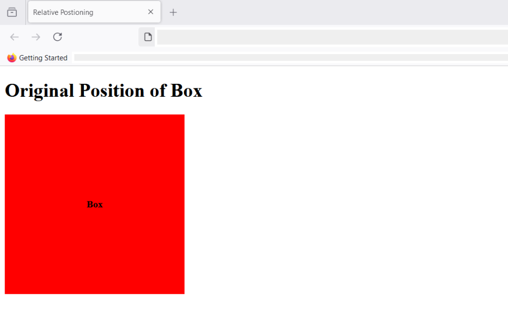
As we know , when you set position:relative on any element you can shift that element to top, right, bottom and left by an offset value. You can apply more than one values for an HTML element. Consider this example, the box is in it’s original position(HTML normal flow) has a background of red.
<!DOCTYPE html>
<html>
 <head>
   <meta charset ="UTF-*">
   <title>Original Box Position</title>

   <style>
    /*style information */
     div{
      display: flex;
      justify-content: center;
      align-items: center;
      font-weight: bold;
     }
       .box{
        background-color: red;
        width: 300px;
        height: 300px;
       }

   </style>
 </head>
<body>
   <h1>Original Position</h1>
   <div class="box">
       <p>Box</p>
   </div>
    </div>
</body>
</html>
Here is the result:

After we have applied the following CSS to the box, it’s position changes relative to the original position.
   .box{
        background-color: red;
        width: 300px;
        height: 300px;
        position:relative;
        top: 20px;
        left: 200px;
       }
Here is the result after position: relative; is applied with top and left values.

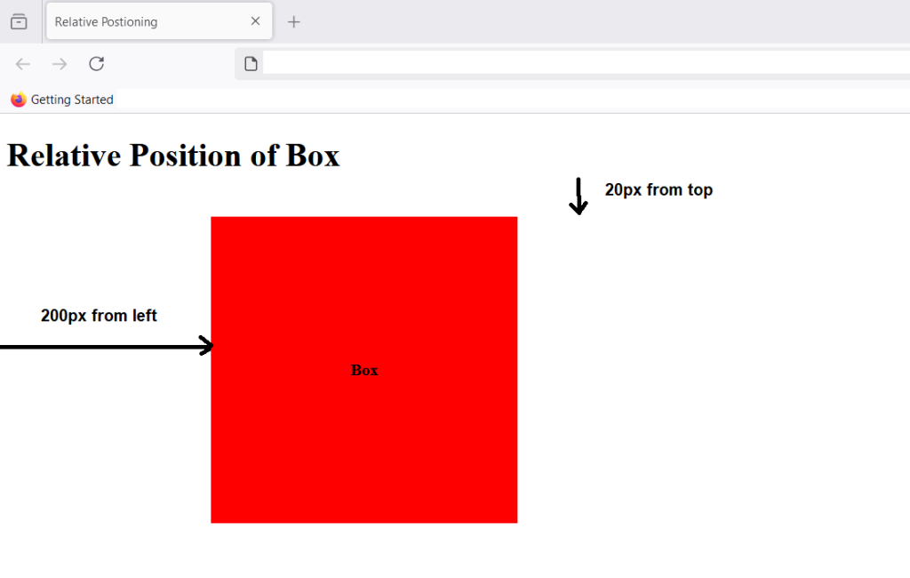
The element shifted 20px from the top relative to the original normal flow of the element, it also shifted 200px from left due the left value we set on the box in CSS.
position: absolute
Evey block in HTML has ancestor block, if a block has no ancestor , them body becomes its ancestor, which is another way of saying ” the HTML body contains that block”. Here block can be any layout elements like div, section,paragraph, etc.
When you set position; absolute; for an element, it aligns relative to the ancestor or the containing block. If there is no ancestor block, then the default ancestor is HTML body. The position is determined from the starting edge of the ancestor element. The offset values of top, left, right, and bottom is computed from the leftmost edge of the ancestor element.
Let’s understand this with an example.
<!DOCTYPE html>
<html>
 <head>
   <meta charset ="UTF-*">
   <title>Position Absolute</title>

   <style>
    /*style information */

       .box-parent{
        background-color: red;
        position:relative;
        top: 50px;
        left: 100px;
        width: 400px;
        height: 400px;
       }
      .box-child
      {
        background-color: lightblue;
        position: absolute;
        width: 300px;
        height: 200px;
       }

      .box-grandchild{
        position:absolute;
        width: 200px;
        height:50px;
        background-color: yellow;
      }

   </style>
 </head>
<body>
   <h1>Position Absolute</h1>
   <div class="box-parent">
       <p>Box-parent</p>
       <div class="box-child">
        <p>Box-child</p>
        <div class="box-grandchild">
          <p>box-grandchild</p>
        </div>
       </div>
   </div>

</body>
</html>
In the above example, there are three boxes – parent box, child box and grandchild box. The parent box is red contains child box and given blue background. The child box contains grandchild box whose background is yellow.
Here’s what you get when the page is displayed in the browser.

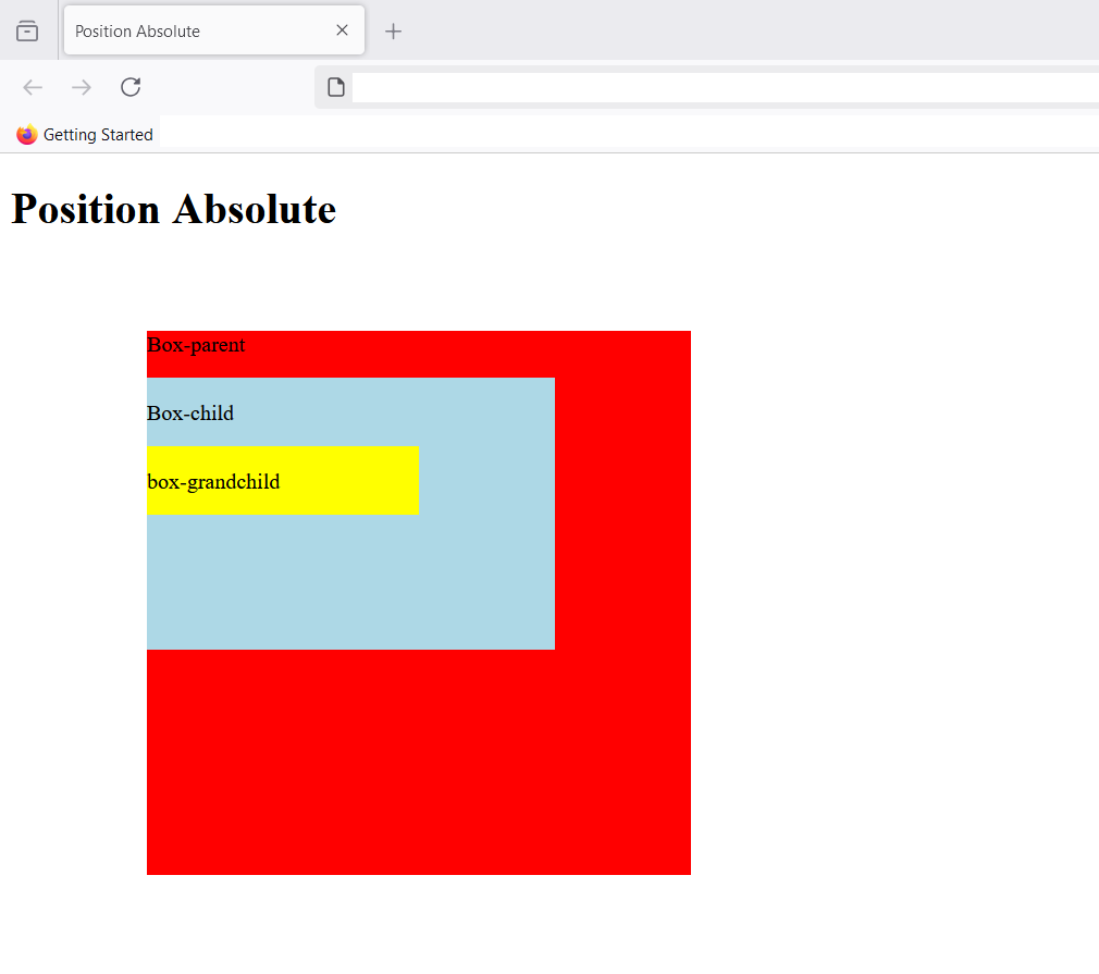
The child element is aligned to parent element , since no left , top, bottom or right is set, the child element (blue box) appears in a normal flow after the paragraph element , it is next block level element. You can still take it out of the normal flow by specifying new top, bottom, left and right values.If there is a margin value , it is included in the values of top, left, right and bottom if specified.
The grandchild box (yellow) also have similar properties, it is in normal flow, but position:absolute; allows to shift the box to a new position.
Note that absolute position is also like relative position, the element can overlap its parents in stacking context with or without z-index.
position: fixed;
The fixed position is also absolute positioning with a difference. It is absolute positioning relative to the viewport (Browser’s visible screen). Whatever is above-the-fold is part of viewport. The above-the-fold is that part of the screen which you can view without scrolling.
Since, the position is fixed, the element is stay in its absolute position even when you scroll down. It is used to display ads, banners, navigation or sidebars that has to remain fixed on a website. It does not goes away with scrolling as long as you remain on the same page.
Consider this example, here I have made a small blog with sidebar and the top navigation is fixed.
<!DOCTYPE html>
<html>
 <head>
   <meta charset ="UTF-*">
   <title>HTML position - fixed</title>
   <style>
    /*style information*/
   .container{
    margin: 0;
    padding:0;
   }
    .navbar > ul{
      background-color: #000;
      color:white;
      display:flex;
      align-items: center;
      list-style-type:none;
      width: 100%;
      padding: 20px;
    }
.mainsection{
  display: flex;
  padding: 20px;
}
.navbar ul {
  position:fixed;
  top:0;
}
.navbar ul li {
  width: 70px;
}
    .main{
      width: 60%;
      background-color: beige;
      padding: 30px;
    }
    .sidebar{
      width: 35%;
      background-color: gold;
      padding:30px;
    }
   </style>
 </head>
<body>
  <div class="container">

   <div class="navbar">
    <ul>
        <li><a>Home</a></li>
        <li><a>Products</a></li>
        <li><a>Blog</a></li>
        <li><a>About</a></li>
        <li><a>Contact</a></li>
    </ul>
   </div>
   <div class="mainsection">

   <div class="main">
    <h1>Header 1</h1>
    <p>Lorem ipsum dolor sit amet consectetur, adipisicing elit. Voluptas dolores natus eligendi, accusantium eaque tenetur ipsum adipisci officiis. Facilis, omnis ducimus atque illo eum facere pariatur mollitia veritatis inventore provident.</p>
   <p>Lorem ipsum dolor sit amet consectetur adipisicing elit. Explicabo exercitationem quo dignissimos odio nihil molestiae ipsum, officia eaque quod deleniti nesciunt dicta nemo reprehenderit esse assumenda architecto expedita suscipit? Iusto!
    Lorem ipsum dolor sit amet consectetur adipisicing elit. Perferendis, veritatis laborum iusto at nesciunt delectus, iste iure mollitia consequatur voluptatem, eum consequuntur nam incidunt architecto quis harum autem eligendi <id class="lorem">Lorem ipsum dolor, sit amet consectetur adipisicing elit. Eveniet doloribus fugiat quos sed totam consequuntur nulla assumenda ab itaque animi aliquam repellendus iusto beatae, eaque, eligendi tempore, delectus consequatur at.</id>
   </p>
   <h2>Header 2</h2>
   <p>Lorem ipsum dolor sit amet consectetur adipisicing elit. Explicabo exercitationem quo dignissimos odio nihil molestiae ipsum, officia eaque quod deleniti nesciunt dicta nemo reprehenderit esse assumenda architecto expedita suscipit? Iusto!
    Lorem ipsum dolor sit amet consectetur adipisicing elit. Perferendis, veritatis laborum iusto at nesciunt delectus, iste iure mollitia consequatur voluptatem, eum consequuntur nam incidunt architecto quis harum autem eligendi <id class="lorem">Lorem ipsum dolor, sit amet consectetur adipisicing elit. Eveniet doloribus fugiat quos sed totam consequuntur nulla assumenda ab itaque animi aliquam repellendus iusto beatae, eaque, eligendi tempore, delectus consequatur at.</id>
   </p>
   <h2>Another Header 2</h2>
   <p>Lorem ipsum dolor sit amet consectetur adipisicing elit. Explicabo exercitationem quo dignissimos odio nihil molestiae ipsum, officia eaque quod deleniti nesciunt dicta nemo reprehenderit esse assumenda architecto expedita suscipit? Iusto!
    Lorem ipsum dolor sit amet consectetur adipisicing elit. Perferendis, veritatis laborum iusto at nesciunt delectus, iste iure mollitia consequatur voluptatem, eum consequuntur nam incidunt architecto quis harum autem eligendi <id class="lorem">Lorem ipsum dolor, sit amet consectetur adipisicing elit. Eveniet doloribus fugiat quos sed totam consequuntur nulla assumenda ab itaque animi aliquam repellendus iusto beatae, eaque, eligendi tempore, delectus consequatur at.</id>
   </p>
  </div>
   <div class="sidebar">
    <h2>Sidebar Header 2</h2>
    <p>Lorem ipsum dolor sit amet consectetur adipisicing elit. At quibusdam, cupiditate possimus molestias facere earum veritatis ducimus praesentium recusandae molestiae vel nulla. Aliquid, omnis quam? Sunt ullam architecto natus quis?</p>
    <ul>
      <li>Lorem ipsum dolor sit amet consectetur adipisicing elit. Quisquam molestias asperiores ullam quidem commodi animi aperiam eaque ea facilis dicta amet neque deleniti, dolore cumque debitis adipisci assumenda eum vero.</li>
      <li>Lorem ipsum dolor sit amet consectetur adipisicing elit. Porro delectus modi adipisci quasi qui temporibus necessitatibus distinctio, beatae inventore sunt iure. Reiciendis veritatis quos qui aliquid vero sed ipsam molestiae.</li>
      <li>Lorem ipsum dolor sit amet consectetur adipisicing elit. Porro eius corrupti sed harum ullam qui asperiores nisi delectus, distinctio debitis ipsam aut. Asperiores cupiditate in possimus quisquam, ducimus incidunt minus.</li>
      <li>Lorem ipsum dolor sit amet consectetur adipisicing elit. Assumenda harum et vel, repellendus cum autem rerum dolorem iste, qui veniam eaque tempore unde maxime ea est quod, quia fugit id?</li>
      <li>Lorem ipsum dolor sit amet consectetur adipisicing elit. Quas doloremque numquam, in amet officiis odit quos fuga culpa corporis voluptates optio sapiente soluta ad nisi dolor asperiores eveniet deserunt maiores.</li>
  </ul>

  </div>
    </div>
    </div>
    </body>
    </html>
Here is the output in the browser.

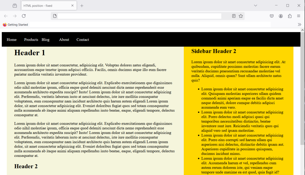
The blog has sidebar and main section with enough dummy content that you need to scroll down to see the text below the fold. Even if you scroll , the top navigation won’t go away as it is fixed relative to the viewport. The scrolling action don’t change viewport, so navigation is going to remain fixed.
position: sticky
The position:sticky; is both relative and fixed. The fixed position is fixed all the time, once you set it will remain fixed. However, sticky position is fixed only when a certain scroll position is reached. Until then it remain relative to normal flow.
Let’s understand this with an example,
<!DOCTYPE html>
<html lang="en">
<head>
  <meta charset="UTF-8">
  <meta name="viewport" content="width=device-width, initial-scale=1.0">
  <title>Position Sticky</title>
  <style>
    /*style information */
    .container{
       background-color: beige;
        margin:0;
        padding:20px;
        border:5px solid black;
        width:50%;
        height: 150px;
        overflow-y: auto;
    }
    .sticky-box{
      position:sticky;
      top:0px;
      background-color: yellow;
      padding: 20px;
    }
  </style>
</head>
<body>
  <div class="container">
    <h2>Position sticky </h2>
    <p>Lorem ipsum dolor sit amet consectetur adipisicing elit. Quo asperiores vitae nostrum quaerat maxime! Accusamus iusto, minima porro id maxime, laudantium cum quibusdam earum libero eum distinctio incidunt? Non, debitis.</p>
    <div class="sticky-box">
      <strong>This is a sticky box.</strong>
    </div>
    <p>Lorem ipsum, dolor sit amet consectetur adipisicing elit. Doloremque consequuntur error, quam perspiciatis nemo excepturi rerum suscipit ratione molestiae eligendi atque culpa enim saepe labore necessitatibus libero veniam esse est.</p>
    <p>Lorem, ipsum dolor sit amet consectetur adipisicing elit. Beatae voluptate aspernatur vero nisi itaque perferendis? Debitis id, a repellendus ipsa repellat ex sequi doloremque consequatur iure distinctio, vel facilis sunt! Lorem ipsum, dolor sit amet consectetur adipisicing elit. Ex, aliquam reprehenderit dolores adipisci est similique facere eveniet officiis numquam nostrum minus tempora voluptates, consectetur ab distinctio cupiditate repellendus labore quae.</p>
  </div>
</body>
</html>
The above HTML and CSS will create a box with a sticky element. User can scroll the box beyond 150px to see the rest of the content inside the box. Here is what you see in browser.

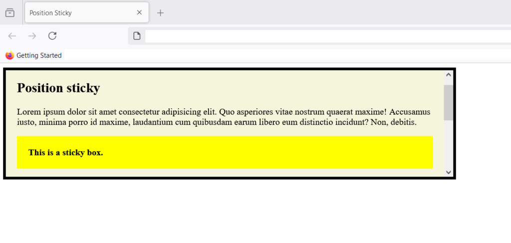
When you try to scroll the box and yellow sticky box goes up and reach top:0px and at that point the sticky element acts like a fixed element. You can set set four values – top, left, bottom and right to position the sticky element.
Note that any margin or padding value is included in the offset values of top, left, bottom and right.
Summary
You have learned about five different values of CSS position property. The static is the default position, relative is relative to normal HTML flow, the absolute position is a position relative to its immediate ancestor, fixed position is relative to viewport and remain fixed even when user scroll. The sticky position is both relative and fixed. It become fixed when reach a certain scroll position from user.