HTML elements are either block-level or inline elements. The inline elements are enclosed within a block level element. CSS treats each block-level HTML element as if it is in a box. This is known as CSS box model.
With CSS, you have control over the boxed HTML elements. You can change the look and feel of the element and change its position on a page. The CSS box model offers the following things
- Change the dimension of an element such as width and height.
- You can change the border of the elements.
- Change the margin of an element.
- You can change padding for an element.
- You can also show or hide an element on the page.
In this post, you will learn about components of CSS box model with examples. We encourage you to try the examples by yourself and see how it works, in this way, you will learn faster.
Width and Height Property
With CSS, you can change the dimensions of an HTML element using width and height properties. These CSS properties are
- Width
- Height
- Min-width and Max-width
- Min-height and Max-height
There are two ways to define these properties in CSS, they are
- Use fixed values such as px, pts., em.
- Use percentage (%) values for responsive design.
- Inherit – the values of width and height are inherited from parent elements.
Note: for who do not know, a responsive design is a type of CSS design optimized for multiple devices such as tablet, mobile and so on.
Example: Width and Height
In this example, you will create an HTML page with internal CSS codes that will set width and height of two <div> elements.
Step 1: Create a folder on your computer and call it box-model-example.
Step 2: Open notepad and create a new file inside box-model-example called index.html and save it.
Step 3: Open the file index.html in notepad and type the following HTML code into the file and save it.
<!DOCTYPE html>
<html>
<head>
     <title> Width and Height CSS Property</title>
     <script type="text/css">
     </script>
</head>
<body>
     <div class="box1">
          <h2>BOX 1</h2>
          <p>This is content of box 1.</p>
     </div>
     <div class="box2">
          <h2>BOX 2</h2>
          <p> This is content of box 2.</p>
     </div>
</body>
</html>
Step 4: Open index.html file again and type the following CSS code between <style> tags. This code will set do following changes
- Set background color for both boxes.
- Set width and height of only box 2.
- Add some padding for text content, you will learn about padding in next section.
.box1 {
     background-color: lightgreen;
     padding:10px;
}
.box2 {
     background-color: beige;
     padding: 10px;
     width: 200px;
     height : 300px;
}
Save the changes and view the result in the browser.
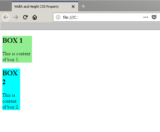
Output

In the above example, box 2 is limited with width and the height property. However, box 1 is displayed as full block element.
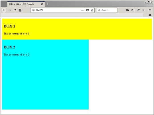
Example: Max-width and Min-width
In an HTML page, the height and width property can change if you are using a responsive design, you have different screen width or height for different devices. To avoid problem with width or height property, you can set a min-height or min-width and max-height or max-width value. The content of the element cannot exceed this height or width values or start with a minimum value. In this example, you will use the previous example and set min-height and max-height, min-width and max-width for two boxes.
Step 1: go back to index.html page and open it with notepad.
Step 2: Add following CSS code between <style> tags, replacing the previous CSS codes.
.box1 {
     background-color:lightgreen;
     min-height: 50px;
     max-height: 100px;
     min-width: 50px;
     max-width: 100px;
}
.box2 {
     background-color:cyan;
     min-width: 40px;
     max-width: 60px;
}
Output in the browser