Table of Contents
In the previous article, you learned about the CSS float and CSS clear to create a layout for web page. In this article, we are going to introduce you to HTML layout using CSS flex box. The CSS flex-box is responsive container that solve the problem of floating and positioning the HTML inline and block elements.
Problem With CSS Float
Other than adjusting the position of floated elements and its position in relation to non-floated element. The main problem with floated elements are that it will not adjust to the size of the container.
For example, in the following figure there are three images displayed side-by-side and one of the image in the middle is smaller than the other images. The background black is the image container.
<style>
* {
  box-sizing: border-box;
}
.img-container {
  float: left;
  width: 33.33%;
  padding: 5px;
  background:black;
}
.clearfix::after {
  content: "";
  clear: both;
  display: table;
}
Output To Browser
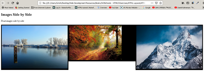
You can clearly see that the image background for middle images become smaller than the other images. The flex-box containers do not have this problem. The flex-box container adjust itself to the height of the largest element inside the box. For example, the above example in flex-box would appear as follows.
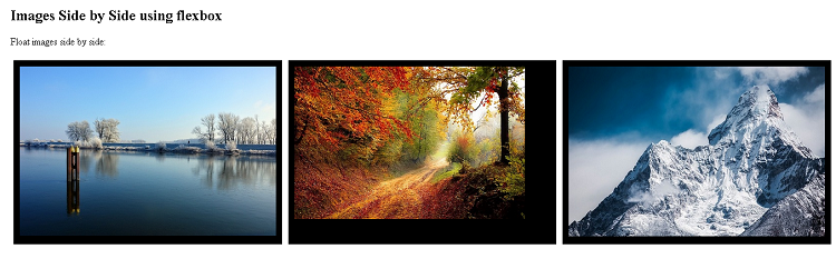
The above figure clearly shows that the image size of middle is reduced but the container size remain the same.
List of Flexbox Properties
Here is a list of flex-box properties. We will explore flex-box more in future tutorials.
| Flex Property | Description |
| flex-direction | give a direction to the flow of objects within a container |
| flex-wrap | defines it the flex-items (boxes) will wrap or not. |
| flex-flow | shorthand to set flex-direction and flex-wrap |
| justify-content | align the flex-items (boxes) horizontally (left,center,right) |
| align-items | align the items vertically (top, center, bottom) |
| align-content | align items along the flex lines using space-between, space-around, flex-end, flex-start, center, stretch values. |
Example Layout Using Flexbox
<!DOCTYPE html>
<html>
<head>
<title>Layout Using Flexbox</title>
<meta charset="utf-8">
<style>
* {
box-sizing:border-box;
}
#header {
width:80%;
background:black;
color:white;
display:flex;
flex-direction: column;
padding:2%;
margin:auto;
}
#navbar ul {
list-style-type:none;
color:#ff0000;
background:yellow;
display:flex;
}
#navbar li{
margin-left:2%;
padding:2%;
}
#navbar li:hover {
background:black;
color:white;
}
#sidebar {
width:25%;
background:yellow;
color:black;
text-align:left;
padding:2%;
}
#sidebar nav {
list-style-type:none;
}
#sidebar a{
color: red;
margin:2%;
padding:2%;
}
#main-container {
width:80%;
margin:auto;
display:flex;
flex-direction:row;
}
#main {
width:75%;
background:beige;
padding:2%;
margin:auto;
text-align:left;
}
#footer {
width:80%;
padding:2%;
margin:auto;
text-align:center;
background:black;
color:white;
}
</style>
</head>
<body>
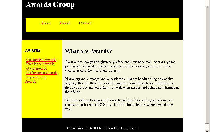
<header id="header">
<h1>Awards Group</h1>
<nav id="navbar">
<ul>
<li>About</li>
<li>Awards</li>
<li>Contact</li>
</ul>
</nav>
</header>
<section id="main-container">
<!-- Sidebar Section -->
<section id="sidebar">
<header><h3>Awards</h3></header>
<nav>
<li><a href="#">Outstanding Awards</a></li>
<li><a href="#">Excellence Awards</a></li>
<li><a href="#">Good Awards</a></li>
<li><a href="#">Performance Awards</a></li>
<li><a href="#">Improvement Awards</a></li>
</nav>
</section>
<main id="main">
<header>
<h2> What are Awards? </h2></header>
<article id="main-article">
<p>
Awards are recognition given to professional, business men, doctors, peace promotors, scientists, teachers and many other oridinary
citizens for there contribution to the world and country.</p>
<p>Not everyone is exceptional and telented, but are hardworking and achive anything through their sheer determination. Some awards are incentives
for those people to motivate them to work even harder and achive new heights in their fields.</p>
<p>We have different category of awards and inviduals and organizations can receive a cash prize of $1000 to $50000 depending on
which award they won.</p>
</p>
</article>
</main>
</section>
<!-- main ends here -->
<!-- footer section -->
<footer id="footer">
<p> Awards-group©-2000-2012-All rights reserved.</p>
</footer>
</body>
</html>Output – HTML Layout Using Flexbox