HTML Iframe
An iframe is a special HTML element that display one webpage inside another web page. There are some additional property that makes iframe very useful.
Iframe syntax
<iframe src="" width="" height=""></iframe>In the syntax above the src attribute points to the source of another web page. A source could be absolute address - https:// or a relative address such as /web/product.html'.
Example : iframe
In this example, we will create two HTML pages – iframe-main.html and iframe-secondary.html. The main page will embed the secondary page using iframe.
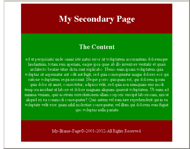
iframe-secondary.html
<!DOCTYPE html>
<html>
<head>
     <title>Iframe Secondary Page</title>
     <meta charset="utf-8">
     <style>
          #title,#footer{
               background:#8b0000;
               color:white;
               width:80%;
               margin:auto;
               padding:2%;
               text-align:center;
               }
          #container{
               margin:auto;
               width:80%;
               padding:2%;
               background:#008b00;
               color:#ffffff;
               text-align:center;
               }
     </style>
</head>
<body>
     <header id="title">
          <h1>My Secondary Page</h1>
     </header>
     <section id="container">
          <main id="main-area">
          <h2>The Content</h2>
          <p>ed ut perspiciatis unde omnis iste natus error sit voluptatem accusantium doloremque laudantium, totam rem    aperiam, eaque ipsa quae ab illo inventore veritatis et quasi architecto beatae vitae dicta sunt explicabo. Nemo enim ipsam voluptatem quia voluptas sit aspernatur aut odit aut fugit, sed quia consequuntur magni dolores eos qui ratione voluptatem sequi nesciunt. Neque porro quisquam est, qui dolorem ipsum quia dolor sit amet, consectetur, adipisci velit, sed quia non numquam eius modi tempora incidunt ut labore et dolore magnam aliquam quaerat voluptatem. Ut enim ad minima veniam, quis nostrum exercitationem ullam corporis suscipit laboriosam, nisi ut aliquid ex ea commodi consequatur? Quis autem vel eum iure reprehenderit qui in ea voluptate velit esse quam nihil molestiae consequatur,
vel illum qui dolorem eum fugiat quo voluptas nulla pariatu</p>
          </main>
     </section>
     <footer id="footer">
          <p>My-Iframe-Page©-2001-2012-All Rights Reserved.</p>
     </footer>
</body>
</html>
Output – iframe-secondary.html
iframe-main.html
<!DOCTYPE html>
<html>
<head>
     <title>Iframe Main Page</title>
     <meta charset="utf-8">
     <style>
          #title,#footer{
               background:blue;
               color:white;
               width:80%;
               margin:auto;
               padding:2%;
               text-align:center;
               }
          #container{
               margin:auto;
               width:80%;
               padding:2%;
               background:#343434;
               text-align:center;
               }
      </style>
</head>
<body>
     <header id="title">
          <h1>My Iframe Page</h1>
     </header>
     <section id="container">
          <main id="main-area">
          <iframe src="iframe-secondary.html" width="500" height="300"></iframe>
          </main>
     </section>
     <footer id="footer">
          <p>My-Iframe-Page©-2001-2012-All Rights Reserved.</p>
     </footer>
</body>
</html>
Output: iframe-main.html
Iframe No Border
To remove the border use the following CSS code.
iframe {
   border:none;
}
Making Iframe as Target of a Link
You can use the name attribute and target attribute of link to open a page in iframe.
HTML Code
<iframe src="default.html" name="my_iframe" width="400" height="400"></iframe>
<!-- link code below -->
<p><a href="https://notesformsc.org" target=my_iframe">Notesformsc</a></p>HTML Layout Using Grid
In the previous article, you have learned about flex-box layout. You can create a grid like structure in HTML page using flex-box. In a grid like structure all blocks would be equal sized. But that involves adjusting each box using flex. The HTML and CSS has a different display property just for a grid layout. In this article, you will learn to create an HTML page with grid layout.
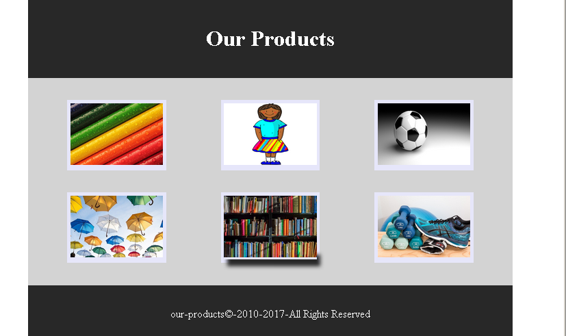
Example: HTML Grid Layout
In this section, we will be creating a simple grid layout with 6 product image and their captions. You will also use HTML 5 semantic elements to create the page.
HTML and CSS Code for Product Page
<!DOCTYPE html>
<html>
<head>
    <title>HTML Grid Layout - Product Page</title>
	<meta charset="utf-8">
	<style>
	  #main-title,#footer {
	    width:80%;
		margin:auto;
		padding:2%;
		text-align:center;
		background: #282828;
		color: #ffffff;
	  }
	 #main-area{
	  width: 80%;
	  margin:auto;
	  padding:2%;
	  display:grid;
	  grid-template-columns:1fr 1fr 1fr;
	  background:lightgray;
	 }
	.img-product{

	 height:auto;
	 background:lavender;
	 padding:2%;
	 text-align:center;
	}
	.img-product a:hover {
	   box-shadow: 5px 10px 5px #282828;
	}
	</style>
</head>
<body>
<header id="main-title">
<h1>Our Products</h1>
</header>
<main id="main-area">
   <figure class="img-product" id="box-1">
   <a href="#"><img src="images/pencils.jpg" width="100%"></a>
   </figure>
   <figure class="img-product" id="box-2">
   <a href="#"><img src="images/uniform.png" width="100%"></a>
   </figure>
   <figure class="img-product" id="box-3">
   <a href="#"><img src="images/football.png" width="100%"></a>
   </figure>
   <figure class="img-product" id="box-4">
   <a href="#"><img src="images/umbrellas.jpg" width="100%"></a>
   </figure>
   <figure class="img-product" id="box-5">
    <a href="#"><img src="images/books.jpg" width="100%"></a>
   </figure>
   <figure class="img-product" id="box-6">
   <a href="#"><img src="images/shoes.jpg" width="100%"></a>
   </figure>
</main>
<footer id="footer">
<p>our-products©-2010-2017-All Rights Reserved</p>
</footer>
</body>
</html>
Output To Browser – Product Grid
HTML Layout using Flexbox
In the previous article, you learned about the CSS float and CSS clear to create a layout for web page. In this article, we are going to introduce you to HTML layout using CSS flex box. The CSS flex-box is responsive container that solve the problem of floating and positioning the HTML inline and block elements.
Problem With CSS Float
Other than adjusting the position of floated elements and its position in relation to non-floated element. The main problem with floated elements are that it will not adjust to the size of the container.
For example, in the following figure there are three images displayed side-by-side and one of the image in the middle is smaller than the other images. The background black is the image container.
<style>
* {
  box-sizing: border-box;
}
.img-container {
  float: left;
  width: 33.33%;
  padding: 5px;
  background:black;
}
.clearfix::after {
  content: "";
  clear: both;
  display: table;
}
Output To Browser
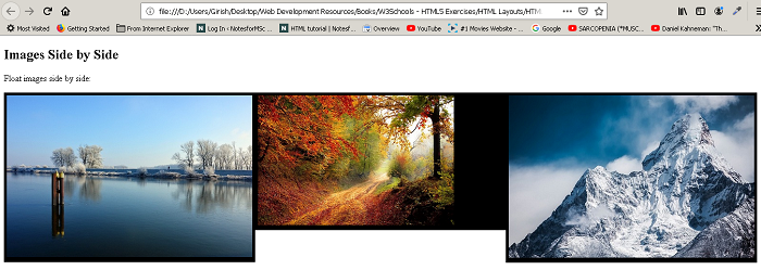
You can clearly see that the image background for middle images become smaller than the other images. The flex-box containers do not have this problem. The flex-box container adjust itself to the height of the largest element inside the box. For example, the above example in flex-box would appear as follows.
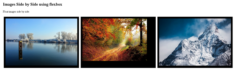
The above figure clearly shows that the image size of middle is reduced but the container size remain the same.
List of Flexbox Properties
Here is a list of flex-box properties. We will explore flex-box more in future tutorials.
| Flex Property | Description |
| flex-direction | give a direction to the flow of objects within a container |
| flex-wrap | defines it the flex-items (boxes) will wrap or not. |
| flex-flow | shorthand to set flex-direction and flex-wrap |
| justify-content | align the flex-items (boxes) horizontally (left,center,right) |
| align-items | align the items vertically (top, center, bottom) |
| align-content | align items along the flex lines using space-between, space-around, flex-end, flex-start, center, stretch values. |
Example Layout Using Flexbox
<!DOCTYPE html>
<html>
<head>
<title>Layout Using Flexbox</title>
<meta charset="utf-8">
<style>
* {
box-sizing:border-box;
}
#header {
width:80%;
background:black;
color:white;
display:flex;
flex-direction: column;
padding:2%;
margin:auto;
}
#navbar ul {
list-style-type:none;
color:#ff0000;
background:yellow;
display:flex;
}
#navbar li{
margin-left:2%;
padding:2%;
}
#navbar li:hover {
background:black;
color:white;
}
#sidebar {
width:25%;
background:yellow;
color:black;
text-align:left;
padding:2%;
}
#sidebar nav {
list-style-type:none;
}
#sidebar a{
color: red;
margin:2%;
padding:2%;
}
#main-container {
width:80%;
margin:auto;
display:flex;
flex-direction:row;
}
#main {
width:75%;
background:beige;
padding:2%;
margin:auto;
text-align:left;
}
#footer {
width:80%;
padding:2%;
margin:auto;
text-align:center;
background:black;
color:white;
}
</style>
</head>
<body>
<header id="header">
<h1>Awards Group</h1>
<nav id="navbar">
<ul>
<li>About</li>
<li>Awards</li>
<li>Contact</li>
</ul>
</nav>
</header>
<section id="main-container">
<!-- Sidebar Section -->
<section id="sidebar">
<header><h3>Awards</h3></header>
<nav>
<li><a href="#">Outstanding Awards</a></li>
<li><a href="#">Excellence Awards</a></li>
<li><a href="#">Good Awards</a></li>
<li><a href="#">Performance Awards</a></li>
<li><a href="#">Improvement Awards</a></li>
</nav>
</section>
<main id="main">
<header>
<h2> What are Awards? </h2></header>
<article id="main-article">
<p>
Awards are recognition given to professional, business men, doctors, peace promotors, scientists, teachers and many other oridinary
citizens for there contribution to the world and country.</p>
<p>Not everyone is exceptional and telented, but are hardworking and achive anything through their sheer determination. Some awards are incentives
for those people to motivate them to work even harder and achive new heights in their fields.</p>
<p>We have different category of awards and inviduals and organizations can receive a cash prize of $1000 to $50000 depending on
which award they won.</p>
</p>
</article>
</main>
</section>
<!-- main ends here -->
<!-- footer section -->
<footer id="footer">
<p> Awards-group©-2000-2012-All rights reserved.</p>
</footer>
</body>
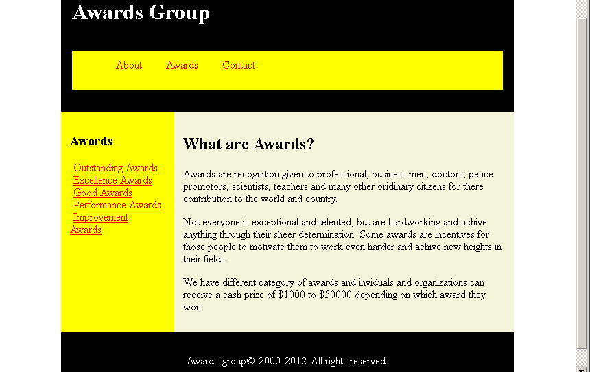
</html>Output – HTML Layout Using Flexbox
HTML Layout using Float and Clear
In the previous article, you have learned about the HTML layout basic such as semantic HTML tags and so on. In this lesson,we begin with different techniques to design page using CSS.
The aim is not too teach you CSS, but to make you understand be basic idea that goes behind making a layout using different techniques with HTML.
HTML Document Flow
Earlier we discussed about inline and block level elements in HTML. Together they form the flow of the HTML documents. A block level element such as header will take entire width and other elements such as image is inline element that only takes required space.The normal flow of document is a single column of block elements which encloses inline elements according to the requirements.
CSS Float and Clear
In CSS, there are properties that can break the normal flow of the document and rearrange the elements in such a way that it make sense.
The CSS <mark style="background-color:rgba(0, 0, 0, 0);color:#b51212" class="has-inline-color">float </mark>has following values :
<mark style="background-color:rgba(0, 0, 0, 0);color:#c51313" class="has-inline-color">float : left </mark><mark style="background-color:rgba(0, 0, 0, 0);color:#b81313" class="has-inline-color">float : right</mark><mark style="background-color:rgba(0, 0, 0, 0);color:#b10e0e" class="has-inline-color">float :none</mark><mark style="background-color:rgba(0, 0, 0, 0);color:#b31717" class="has-inline-color">float : inherit</mark>
The clear property bring back the normal flow except those elements that are floated right or left. This once the flow of document is broken all element in the document are affected and we do not want that.
For example, consider the following HTML document.
<!DOCTYPE html>
<html>
<head>
<title> Affect of CSS float on HTML document flow</title>
<meta charset="utf-8">
<style>
body{
padding:0;
margin:0;
background: lightsteelblue;
}
#header,#content,#footer{
width:60%;
margin:auto;
padding:20px;
}
#header,#footer {
background:#ff0033;
color:white;
float:left;
}
#content {
background:#0033ff;
color:white;
}
</style>
</head>
<body>
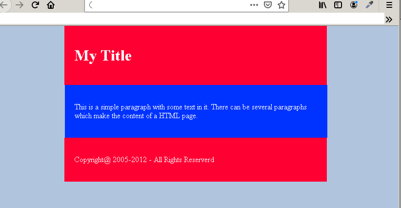
<div id="header">
<h1>My Title</h1>
</div>
<div id="content">
<p>This is a simple paragraph with some text in it. There can be several paragraphs which make the content of a HTML page.</p>
</div>
<div id="footer">
<p>Copyright@ 2005-2012 - All Rights Reserverd </p>
</div>
</body>
</html>Output in Browser
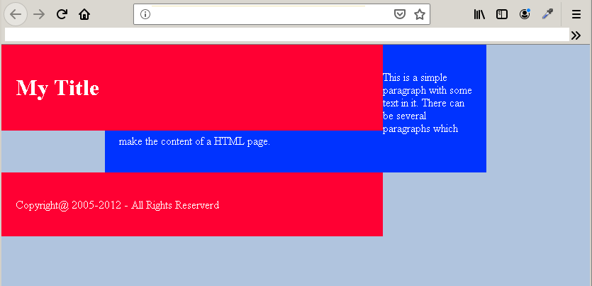
In the example above, there are three boxes – header, content and footer– and each of them are block elements. When the header is floated left the entire flow of the document is disrupted.To bring back the normal flow each element that is floated must also apply CSS <mark style="background-color:rgba(0, 0, 0, 0);color:#a80f0f" class="has-inline-color">clear</mark>. The <mark style="background-color:rgba(0, 0, 0, 0);color:#b80a0a" class="has-inline-color">clear </mark>property has following values:
<mark style="background-color:rgba(0, 0, 0, 0);color:#ca1919" class="has-inline-color">clear:left</mark><mark style="background-color:rgba(0, 0, 0, 0);color:#a81818" class="has-inline-color">clear:right</mark><mark style="background-color:rgba(0, 0, 0, 0);color:#b41010" class="has-inline-color">clear:both</mark>
As you can see that we can apply CSS clear as per our requirement. But to restore the normal flow, you may like to apply the clear: both because we do not want any element on both right or left of the HTML element.The clear must be applied to elements that comes after the floated element only.
  #header,#footer {
       background:#ff0033;
       color:white;
       float:left;
       margin-left:18.5%;
       }
  #content {
       background:#0033ff;
       color:white;
       clear:both;
       }
Output: After applying Clear: Both
You only need to adjust the width, margin, and height of the elements.
Example Page Layout using Float and Clear
<!DOCTPE html>
<html>
<head>
<title>Affect of CSS float on HTML document flow</title>
<meta charset="utf-8">
<style>
body{
padding:0;
margin:0;
background: Whitesmoke;
}
#header {
width:100%;
padding:25px;
margin:auto;
text-align:center;
background:tomato;
color:#000;
font-family:helvetica, sans-serif;
}
#header.h1 {
font-size: 40px;
}
#navigation ul {
list-style-type:none;
padding:10px;
margin-left:7%;
text-align:center;
}
#navigation li{
float:left;
margin-left:5px;
padding:10px;
background:black;
color:white;
}
#navigation li:hover {
background:red;
}
#content {
width:67%;
padding:25px;
margin:10px;
font-size:16px;
color:#000;
font-family:helvetica, sans-serif;
background:pink;
float:left;
}
#sidebar {
width:24%;
background:yellow;
color:#000;
text-align:center;
margin:10px;
padding:0;
float:left;
}
#footer {
width:100%;
padding:2%;
margin:10px;
color:#000;
background:tomato;
text-align:center;
clear:both;
}
</style>
</head>
<body>
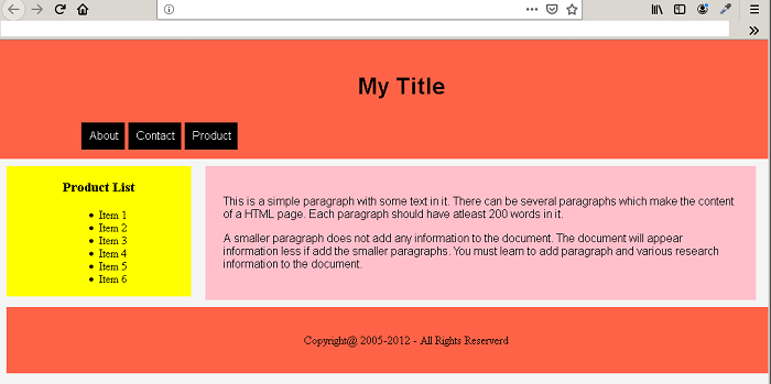
<div id="header">
<h1>My Title</h1>
<nav id="navigation" >
<ul>
<li>About</li>
<li>Contact</li>
<li>Product</li>
</ul>
</nav>
</div>
<div id="sidebar">
<header><h3>Product List</h3></header>
<ul>
<li>Item 1</li>
<li>Item 2</li>
<li>Item 3</li>
<li>Item 4</li>
<li>Item 5</li>
<li>Item 6</li>
</ul>
</div>
<div id="content">
<p>This is a simple paragraph with some text in it. There can be several paragraphs which
make the content of a HTML page. Each paragraph should have at-least 200 words in it. </p>
<p>A smaller paragraph does not add any information to the document. The document will appear information
less if add the smaller paragraphs. You must learn to add paragraph and various research information to the document.</p>
</div>
<div id="footer">
<p>Copyright@ 2005-2012 - All Rights Reserverd </p>
</div>
</body>
</html>Output In Browser
HTML Layout
Websites are made of many kinds of HTML pages and each of the page serves a different purpose. Depending on what a page does , the layout and design of the page changes. A simple layout is the best strategy.
Semantic HTML
Earlier we do not have meaning to HTML tags that identify themselves with the different sections of the page. HTML tags are very much created for the documentation.
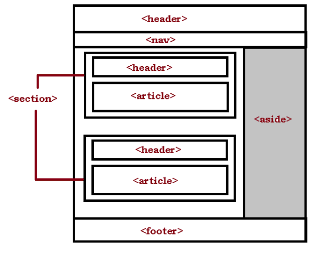
The recent web design put more emphasis on user interface and usability of a web page. Therefore, in HTML 5 we have semantic tags which has specific meaning. These tags help use define the structure of the page at HTML level. The rest of the styling is done using CSS (Cascading Style Sheet). Here is a list of semantic tags and their meaning.
| Tag | Meaning |
<mark style="background-color:rgba(0, 0, 0, 0);color:#b01010" class="has-inline-color"><header></mark> | This defines the header of the document or a different part of the document |
<mark style="background-color:rgba(0, 0, 0, 0);color:#ab1212" class="has-inline-color"><nav></mark> | This is create a navigation menu for the webpage. |
<mark style="background-color:rgba(0, 0, 0, 0);color:#a61111" class="has-inline-color"><section></mark> | This defines a section of the document. A section can have header and extra navigation. |
<mark style="background-color:rgba(0, 0, 0, 0);color:#b41313" class="has-inline-color"><article></mark> | This contains the actual textual content and usually comes under section. Though it is not compulsory because you can have a standalone article. |
<mark style="background-color:rgba(0, 0, 0, 0);color:#a51515" class="has-inline-color"><aside></mark> | This tag is meant for information usually appears in the sidebar section of the document. |
<mark style="background-color:rgba(0, 0, 0, 0);color:#b11515" class="has-inline-color"><footer></mark> | This defines the footer section of the document where website credits appear. |
The Division Tag
The <mark style="background-color:rgba(0, 0, 0, 0);color:#b10909" class="has-inline-color"><div></mark> means division which is to divide the web page into different divisions. The after inserting your content you can simply control the appearance of the<mark style="background-color:rgba(0, 0, 0, 0);color:#af1515" class="has-inline-color"> <div></mark> using CSS.The div tag is still more popular and widely used for creating pages.
Class and Id attribute
After using you tag to create a basic document layout. You must assign <mark style="background-color:rgba(0, 0, 0, 0);color:#c51111" class="has-inline-color">class </mark>and <mark style="background-color:rgba(0, 0, 0, 0);color:#ab1e1e" class="has-inline-color">id </mark>to different elements. You can apply CSS styles to these elements. The guideline to apply CSS rule is
- Apply
<mark style="background-color:rgba(0, 0, 0, 0);color:#b32323" class="has-inline-color">class </mark>to page elements that are repeated several times. - Apply
<mark style="background-color:rgba(0, 0, 0, 0);color:#b72323" class="has-inline-color"> id</mark>to page elements that you know are unique or need specific styles.
Applying CSS Rules
The HTML elements do not have the capability to style the page. The best you can do is to apply inline CSS rule. Majority of style work and design is done using CSS.
How to style your page ?
To style the page using CSS you must consider four things:
- Layout design
- Margin between blocks
- Padding between content and border of the block.
- Typography of the page and element
- Responsive Design
The responsive design is a new term which means not only you design your page for desktop computers, but also, consider a different layout for mobile, and tab devices.
Builtin Design Features vs. Frameworks
CSS has built-in features like <mark style="background-color:rgba(0, 0, 0, 0);color:#9c0b0b" class="has-inline-color">Flexbox</mark> and <mark style="background-color:rgba(0, 0, 0, 0);color:#a70e0e" class="has-inline-color">Grid</mark> which will make the job of page design easier. However, there are many web frameworks such as <mark style="background-color:rgba(0, 0, 0, 0);color:#ae0a0a" class="has-inline-color">Bootstrap</mark> which will make sure that you get a pixel perfect layout for your page and website as quickly as possible.
The most common practice is to use a web framework for web design unless you have a technological constraint to not to use them. In future articles, we will talk about different types of web layout and how to create those layouts using HTML and CSS.
HTML Projects : Personal Portfolio
A personal portfolio is required to tell other people about you work as a professional. In this article, you will create a personal portfolio page with dummy content. The project has following things
- A banner displaying your name
- Navigation link that when clicked will open to different section of the page.
- A grid view of your project and each grid item will open in a new product page.
- A box to ask people to contact you.
Program Code: Personal Portfolio
<!DOCTYPE html>
<html>
<head>
<title>Project: Personal Portfolio</title>
<style>
body{
margin:auto;
background:#282828;
color:#ffffff;
}
#welcone-section {
width:100%;
display:flex;
flex-direction:column;
}
#navbar {
background:darkred;
padding:2%;
width:98%;
text-align:right;
margin:0;
z-index:2;
position:fixed;
top:0;
}
#navbar a{
text-align:right;
padding:3px 10px;
text-decoration:none;
font-size:16px;
font-family:monospace;
color:white;
}
#banner{
width:100%;
height:100vh;
position:relative;
top:30px;
}
article h1{
text-align:center;
position:relative;
top:20%;
font-family:arial,sans-serif;
font-size:54px;
font-weight:bold;
}
article p{
text-align:center;
position:relative;
top:18%;
font-family:monospace;
font-size:28px;
color:red;
}
/*Project Tile */
#projects{
background:gray;
display:grid;
grid-template-columns:1fr 1fr 1fr;
grid-gap:10px;
}
.project-tile{
background:red;
}
</style>
</head>
<body>
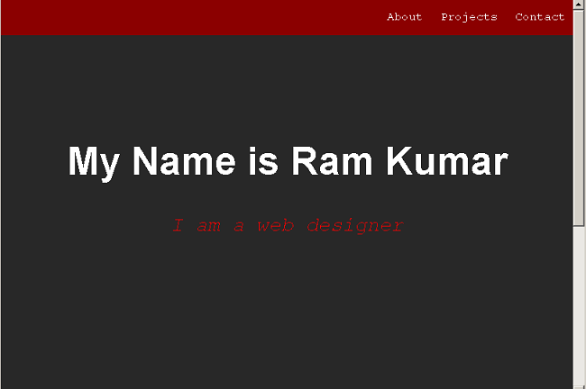
<section id="Welcome-section">
<nav id="navbar">
<a id="profile-link" href="about.html">About</a>
<a href="#projects">Projects</a>
<a href="#contact">Contact</a>
</nav>
<article id="banner">
<h1>My Name is Ram Kumar</h1>
<p><em>I am a web designer</em></p>
</article>
</section>
<header>
<h2>My Projects</h2>
</header>
<section id="projects">
<figure class="project-tile">
<a href="https://codepen.io/GirishS/full/rNBdjgP">
<img src="images/product-page.png" alt="product page">
<figcaption> Tribute Page</figcaption></a>
</figure>
<figure class="project-tile">
<a href="https://codepen.io/GirishS/full/pozLVeQ">
<figcaption> Survey Form Page</figcaption></a>
</figure>
<figure class="project-tile">
<a href="https://codepen.io/GirishS/full/eYOrbba">
<figcaption> Product Page</figcaption></a>
</figure>
<figure class="project-tile">
<a href="https://codepen.io/GirishS/full/aboGrym">
<figcaption>Technical Documentation Page</figcaption></a>
</figure>
<figure class="project-tile">
<a href="https://codepen.io/GirishS/full/aboGrym">
<figcaption>Technical Documentation Page</figcaption></a>
</figure>
</section>
<section id="contact">
<header>
<h2>Hire Me!</h2>
<p>Let's work together...</p>
</header>
</section>
</body>
</html>Output to Browser: Personal Portfolio
There are few special feature of this project They are listed below:
- The project uses both
<mark style="background-color:rgba(0, 0, 0, 0);color:#ae1212" class="has-inline-color">flexbox</mark>and<mark style="background-color:rgba(0, 0, 0, 0);color:#b01919" class="has-inline-color">grid </mark>display. - The portfolio page is responsive in nature. Try making your page smaller.
- We have used HTML 5 semantic elements to build this page.
HTML Projects: Technical Document
In this article, you will learn to create an HTML page for technical documentation. The technical documents usually have two columns and left or right columns have links to other section of the main document or another page. The links in the sidebar when clicked will open in a section of the document.
Program Code: Technical Document
<!DOCTYPE html>
<html>
<head>
<title>Project-4: Technical Documentation</title>
<style>
#main-doc{
display:flex;
width:100%:
font-family:arial, sans-serif;
font-size:16px;
}
#main-body
{
display:flex;
flex-direction:column;
width:75%;
padding:20px;
align-self:flex-start;
background:#cccccc;
font-family:arial, sans-serif;
font-size:16px;
}
#navbar{
padding:20px;
width:20%;
display:flex;
flex-direction:column;
background:#fcfcfc;
font-family:helvetica,arial, sans-serif;
font-size:16px;
}
#navbar ul li{
list-style-type:none;
padding:20px;
border:1px solid gray;
}
#navbar header h1{
text-align:right;
}
#navbar a{
text-decoration:none;
}
/* MOBILE Layout */
@media(max-width:400px)
{
#main-body{
background:cyan;
}
}
</style>
</head>
<body>
<main id="main-doc">
<nav id="navbar">
<header>
<h1>CSS Documentation</h1>
</header>
<ul>
<li><a href="#css_introduction" class="nav-link">CSS Introduction</a></li>
<li><a href="#css_background" class="nav-link">CSS Background</a></li>
<li><a href="#css_border" class="nav-link">CSS Border</a></li>
<li><a href="#css_link" class="nav-link">CSS Link</a></li>
<li><a href="#css_navigation" class="nav-link">CSS Navigation</a></li>
<li><a href="#css_responsive" class="nav-link">CSS Responsive</a></li>
</ul>
</nav>
<section id="main-body">
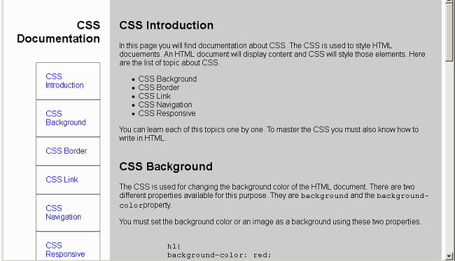
<section class="main-section" id="css_introduction">
<header>
<h2>CSS Introduction</h2>
</header>
<article>
<p>In this page you will find documentation about CSS. The CSS is used to style HTML docuements. An HTML document
will display content and CSS will style those elements. Here are the list of topic about CSS.
</p>
<ul>
<li>CSS Background</li>
<li>CSS Border</li>
<li>CSS Link</li>
<li>CSS Navigation</li>
<li>CSS Responsive</li>
</ul>
<p>You can learn each of this topics one by one. To master the CSS you must also know how to write in HTML.</p>
</article>
</section>
<section class="main-section" id="css_background">
<header>
<h2>CSS Background</h2>
</header>
<article>
<p>The CSS is used for changing the background color of the HTML document.
There are two different properties available for this purpose. They are
<code>background</code> and the <code>background-color</code>property.</p>
<p>You must set the background color or an image as a background using these two properties.</p>
<pre><code>
h1{
background-color: red;
}
</code></pre>
<p>The example for background property. The background gives option to add images or other elements as background.</p>
<pre><code>
body{
background: url('/back-img.gif');
}
</code></pre>
</article>
</section>
<br>
<section class="main-section" id="css_border">
<header>
<h2>CSS Border</h2>
</header>
<article>
<p>The CSS border put a border around HTML elements. There are different style for each border. But you can use solid border which
is the default border.</p>
<p>Here is an example of CSS border.</p>
<pre><code>
div {
border-top: 300px;
border-right:200px;
border-bottom:300px;
border-left:200px;
border-style:solid;
border-color: black;
}
</code></pre>
<p>The above is the long version of setting borders. The shorthand version is given below.</p>
<pre><code>
div {
border: 2px solid black;
}
</code></pre>
</article>
</section>
<section class="main-section" id="css_link">
<header>
<h2>CSS Link</h2>
</header>
<article>
<p>In html, you can create links that will take you to another html page. The CSS link properties will decorate links in many ways.
The links can have background, color and other css properties modied through CSS. Consider the following example.</p>
<pre>
<code>
a {
color:red;
background:black;
}
</code>
</pre>
<p>Sometimes you can use the link pseudo classes to manipulate links to simulate a behaviour.
For example <code>:hover</code> is a class that will change the link once user hover their mouse over the link.</p>
<pre><code>
a:hover {
background:red;
color: white;
}
</code>
</pre>
</article>
</section>
<section class="main-section" id="css_navigation">
<header>
<h2>CSS Navigation</h2>
</header>
<article>
<p>One popular use of CSS is creation of navigation links. You can create a vertical or a horizontal navigation link.
The link and list element of html together with css create beautiful navigations.</p>
<p>When you click on the navigation it will take to same page but different location, or different external website.</p>
</article>
</section>
<section class="main-section" id="css_responsive">
<header>
<h2>CSS Responsive</h2>
</header>
<article>
<p>The CSS flexbox and CSS grid are two popular method to create a responsive website. The responsive web site will always change its
layout and design according to the device viewport.</p>
<p>You can create a mobile ready site with media queries and flex or grid layout. The size of the screen will apply a different CSS.
Therefore, your page will appear differently on different devices.</p>
</article>
</section>
</section>
</main>
</body>
</html>Output: Technical Document
The technical document is responsive in nature. Once you have written the code and saved as an HTML document. Open the page in a browser and try to make it as smaller as possible. You will see the layout of the page changing and that’s because we have include a mobile only CSS called<mark style="background-color:rgba(0, 0, 0, 0);color:#b51919" class="has-inline-color"> @media</mark> (media queries).
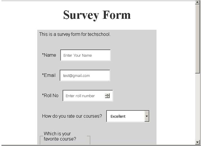
HTML Projects : Survey Form
In this article, you will learn to make survey form using HTML and CSS. The survey form will no do anything, however, you will be able to use HTML elements to create a form and style it with CSS. This survey form is a feedback for a school.The survey form will ask following questions:
- Name, Email address and Roll no.
- Ask to rate the overall experience with courses.
- Ask for favorite courses.
- The form will ask about the most liked thing about the school out of given choices.
- Finally, ask for a few words on how to improve the student experience with the school.
Program Code: techschool.com
<!DOCTYPE html>
<html>
<head>
    <title>HTML Projects - Survey Form</title>
    <meta charset="utf-8">
<script>
   #main{
  width:80%;
  margin:auto;
  background-color:#ffffff;
}
#title{
  text-align:center;
  font-size: 42px;
  color: #333333;
}
#survey-form,p{
  font-size:16px;
  font-family:helvetica, sans-serif;
  margin-left: 20%;
  background-color:#d4d4d4;
  margin: auto;
  width: 60%;
  padding: 1%;
}
#name-label, #email-label, #number-label,#name,#email, #number,#drop-down,label,fieldset,#comments{
  margin-top:30px;
  padding:10px;
  width: 150px;
  align:right;
}
</script>
</head>
<body>
<div id-"main">
<h1 id="title">Survey Form</h1>
<p id="description">This is a survey form for techschool.</p>

<form id="survey-form">
  <label id="name-label" for="name">*Name</label>
 <input type="text" name="name" id="name" placeholder="Enter Your Name" required>
  <br>
 <label id="email-label" for="email">*Email</label>
 <input type="email" name="email" id="email" placeholder="[email protected]" required>
  <br>
  <label id="number-label" for="number">*Roll No</label>
 <input type="number" name="number" id="number" placeholder="Enter roll number" min="0" max="100" required>
  <br>
  <!-- Dropdown starts here -->
  <label for="drop-down">How do you rate our courses?</label>
  <select name="drop-down" id="drop-down">
    <option value="Excellent">Excellent
    </option>
    <option value="Good">Good
    </option>
    <option value="Fair">Fair
    </option>
    <option value="Poor">Poor
    </option>
  </select>
  <br>
  <!-- Fieldset begins here-->
  <fieldset>
    <legend>Which is your favorite course?</legend>
       <input type="radio" name="course" id="science" value="Science">
    <label for="science">Science</label>
    <br>
       <input type="radio" name="course" id="math" value="Math">
     <label for="math">Mathematics</label>
    <br>
       <input type="radio" name="course" id="art" value="Art">
    <label for="art">Art</label>
  </fieldset>
   <!-- Whaat do you like about techschool.com -->
     <!-- Fieldset begins here-->
  <fieldset>
    <legend>What do you like about techschool.com ?</legend>
       <input type="checkbox" name="school" id="classes" value="Classes">
    <label for="classes">Classes</label>
    <br>
       <input type="checkbox" name="school" id="teachers" value="teachers">
     <label for="teachers">Teachers</label>
    <br>
       <input type="checkbox" name="school" id="culture" value="Food">
    <label for="culture">Culture</label>
  </fieldset>
  <!-- Textarea begins -->
  <textarea id="comments" rows="5" columns="500">
    Help us improve. Enter your suggestion s.
  </textarea><br><br>
  <!-- submit button -->
  <input type="submit" id="submit" value="Submit">
  </form>
</div>
</body>
</html>
Output: Survey Form
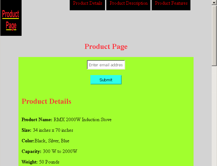
HTML Projects: Product Page using Flexbox
In this exercise, we will create a simple product page using CSS <mark style="background-color:rgba(0, 0, 0, 0);color:#a61919" class="has-inline-color">flex </mark>box. The product page has following features listed below.
- Logo and fixed header
- A form to subscribe using email address
- Product detail section.
- Product description section.
- Product video.
- Finally, a section with 3 product feature box.
HTML and CSS code
Here is the HTML and CSS code for product_page.html.
<!DOCTYPE html>
<html>
<head>
   <title>Project-3 | Product Page</title>
   <style>
body{
   background:lightgray;
   color:black;
   margin:0;
   padding:0;
   }
      #header {
	     width:100%;
		 display:flex;
		}
	 #title{
	   display:flex;
	   justify-content:center;
	   color:#ff2e38;
	   }
   #header-img{
      background:#a1ff2e;
	  width:10%;
	  }
   #nav-bar{
     position:fixed;
     top:0;
	 width:90%;
	 text-align:right;
	}
   #nav-bar a{
     padding:15px 10px;
	 color:red;
	 margin-top:5px;
	 text-decoration:none;
	 background:black;
	}
   #nav-bar a:hover{
     padding:10px;
     color:white;
     background:black;
    }
   #form{
      padding:10px;
	  width:80%;
	  margin:auto;
	  display:block;
	  text-align:center;
	  background:#a1ff2e;
	  color:#ff2e38;
   }
   /* Section Design */
   #details, #desc {
     display:flex;
	 flex-direction:column;
	 width:80%;
	 margin:auto;
	 padding:10px;
	 background: #a1ff2e;
	 }
  video {
    display:block;
    width:60%;
    margin:auto;
    background:#f4f4f4;
    padding:10px;
    }
  #details h2, #desc h2{
	 color:#ff2e38;
   }
   #features {
     background:#a1ff2e;
	 color:black;
     width:80%;
	 margin:auto;
	 display:flex;
	 padding:10px;
   }
   #email{
     width:20%;
     padding:5px;
     }
   #submit {
     background:#2effea;
     color:black;
     border-color:#2effea;
     width:100px;
     padding:5px;
     }
   #box-1, #box-2, #box-3 {
      width: 30%;
      height:auto;
      padding:20px;
      margin:10px 10px 10px 10px;
      border: 10px solid #ff2e38;
      background:lightgray;
    }
   #box-1 strong, #box-2 strong, #box-3 strong{
      color:#ff2e38;
   }
   /* Mobile Design */
   @media(max-width:500px)
   {
   #header,#nav-bar,#details,#desc,#features,#image,#title,#form
   {
      display:flex;
	  flex-direction:column;
	  width:95%;
	  margin:auto;
   }
   #email,#submit{
      width:95%;
   }
   #box-1, #box-2, #box-3 {
    padding:5px;
    width:95%;
    margin:5px 5px 5px 5px;
    border: 5px solid #ff2e38;
    background:lightgray;
      }
   #box-1 strong, #box-2 strong, #box-3 strong{
      color:#ff2e38;
   }
   }
   </style>
</head>
   <body>
    <header id="header">
      <img id="header-img" src="product-img.png" alt="logo" width="120" height="120">
      <nav  id="nav-bar">
         <a class="nav-link" href="#details">Product Details</a>
         <a class="nav-link"  href="#description">Product Description</a>
         <a class="nav-link" href="#features">Product Features</a>
      </nav>
    </header>
    <section>
         <h1 id="title">Product Page</h1>
         <form id="form" action ="https://www.freecodecamp.com/email-submit">
         <input type="email" id="email" name="email" placeholder="Enter email address"><br><br>
         <input type="submit" id="submit" value="Submit">
         </form>
    </section>
    <section id="details">
      <header>
        <h2>Product Details</h2>
      </header>
      <article>
        <p><strong>Product Name:</strong> RMX 2000W Induction Stove</p>
        <p><strong>Size:</strong> 34 inches x 70 inches</p>
        <p><strong>Color:</strong>Black, Silver, Blue</p>
        <p><strong>Capacity:</strong> 300 W to 2000W</p>
        <p><strong>Weight:</strong> 50 Pounds</p>
        <p><strong>Price :</strong> $350 + taxes</p>
        <p><strong>Shipping:</strong> Free</p>
        <p>Note: Shipping cost will change depending on the country and location.You can return the product within 10 days if the product is damaged.</p>
       </article>
     </section>
     <!-- Product Description -->
     <section id="desc">
       <header>
         <h2>Product Description</h2>
       </header>
      <article>
         <p id="description">RMX 2000W Induction stove is one of the best in the market. More than 20000 people have purchased it and had a great experience.The special technique using which make this product is found no where. It has a capacity of 2000W and you can lower the heat. The product is very good in terms of charging and there is 2 year warranty on each piece you purchase. Please read the review at the bottom of this page.</p>
       </article>
     </section>
     <!-- Product Video -->
       <video id="video" width="400" controls>
         <source src="https://video.mp4" type="video/mp4">
         Your browser does not support HTML5 video.
       </video>
     <!-- Features Grid -->
     <section id="features">
       <article id="box-1">
         <strong>Save Costs</strong>
         <p>Save cost by buying this product.There is no electricity required, no charging.</p>
       </article>
       <article id="box-2">
         <strong>Durability</strong>
         <p>Our product does not need maintenance. There is warranty of 2 year for each RMX 2000W induction stove.</p>
       </article>
       <article id="box-3">
         <strong>Design</strong>
         <p>Beautiful sleek design just for your kitchen. Our product comes in various colors.</p>
       </article>
     </section>
</body>
</html>
Output in the Browser
HTML Label
HTML form elements are very useful in collecting information from users, but the a textbox or a radio button is useless without a proper label. The HTML label clear the intention for each form control element. In this article, you will learn about positioning labels, and how to use labels in an HTML form.
HTML Label tag
The HTML label is implemented using <mark style="background-color:rgba(0, 0, 0, 0);color:#a30c0c" class="has-inline-color"><label>...</label></mark> or<mark style="background-color:rgba(0, 0, 0, 0);color:#b91010" class="has-inline-color"> <label> </mark>tags. The <mark style="background-color:rgba(0, 0, 0, 0);color:#a21919" class="has-inline-color"><label></mark> tag in used in conjunction with any input control so there is no need for a <mark style="background-color:rgba(0, 0, 0, 0);color:#b01717" class="has-inline-color"></label></mark> tag.
For example,
<label> UserName: <input type="text" name="username" placeholder="enter username"/>
The second way to specify label is given below.
<label for="username" > UserName:</label>
<input type="text" name="username" placeholder="enter name"/>
The second method is more specific way to label form controls. The labels are separate and tied to element using for attribute.
Positioning Label
There are two ways to position you labels.
- Above or left position
- Right position
Above or Left Position
Not all form controls should have labels above or left. If the control is textbox or drop-downs, then keep the label left or above.
Right Position
When the control is radio buttons, or check boxes then keep the label to the right of each individual radio or check box. What difference it makes, you may ask? It makes lot of difference because every control must be aligned to some other elements. This will give aesthetically pleasing look to the form. So, you must align vertically or horizontally.
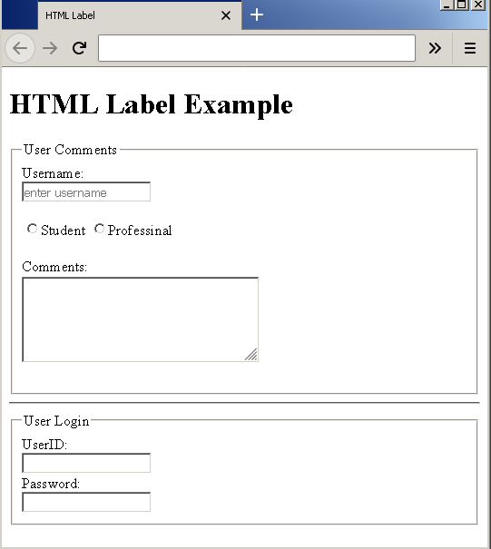
Example Form with Labels
In this example, you will create a blog comment form with login box. Create an HTML page – example-label.html and insert the following code.
<!DOCTYPE html>
<html>
<head>
    <title>HTML Label</title>
</head>
<body>
<h1>HTML Label Example</h1>
     <form action="example.php">
<fieldset>
          <legend>User Comments</legend>
          <label for="username">Username:</label><br/>
          <input type="text" name="username" placeholder="enter username"/><br/><br/>
          <input type="radio" name="student"/><label>Student
          <input type="radio" name="professional"/><label>Professinal<br/><br/>
          <label for="comments">Comments:</label><br/>
          <textarea name="comments" rows="5" cols="30">
          </textarea><br/><br/>
     </fieldset>
  <hr>
     <fieldset>
          <legend>User Login</legend>
          <label>UserID:<br/>
          <input type="text" name="userid" placeholder=" "/><br/>
          <label>Password:<br/>
          <input type="password" name="pwd" placeholder=" "/><br/>
     </fieldset>
   </form>
</body>
</html>
Output