Table of Contents
In the previous article, you have learned about flex-box layout. You can create a grid like structure in HTML page using flex-box. In a grid like structure all blocks would be equal sized. But that involves adjusting each box using flex. The HTML and CSS has a different display property just for a grid layout. In this article, you will learn to create an HTML page with grid layout.
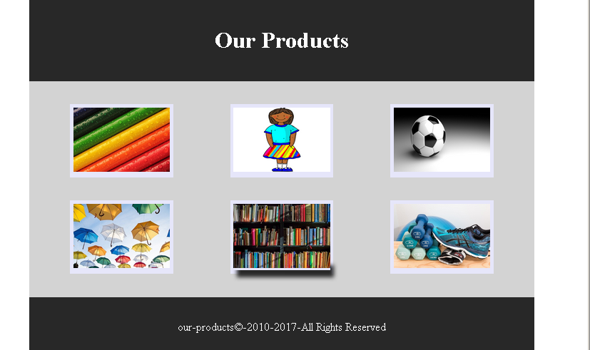
Example: HTML Grid Layout
In this section, we will be creating a simple grid layout with 6 product image and their captions. You will also use HTML 5 semantic elements to create the page.
HTML and CSS Code for Product Page
<!DOCTYPE html>
<html>
<head>
    <title>HTML Grid Layout - Product Page</title>
	<meta charset="utf-8">
	<style>
	  #main-title,#footer {
	    width:80%;
		margin:auto;
		padding:2%;
		text-align:center;
		background: #282828;
		color: #ffffff;
	  }
	 #main-area{
	  width: 80%;
	  margin:auto;
	  padding:2%;
	  display:grid;
	  grid-template-columns:1fr 1fr 1fr;
	  background:lightgray;
	 }
	.img-product{

	 height:auto;
	 background:lavender;
	 padding:2%;
	 text-align:center;
	}
	.img-product a:hover {
	   box-shadow: 5px 10px 5px #282828;
	}
	</style>
</head>
<body>
<header id="main-title">
<h1>Our Products</h1>
</header>
<main id="main-area">
   <figure class="img-product" id="box-1">
   <a href="#"><img src="images/pencils.jpg" width="100%"></a>
   </figure>
   <figure class="img-product" id="box-2">
   <a href="#"><img src="images/uniform.png" width="100%"></a>
   </figure>
   <figure class="img-product" id="box-3">
   <a href="#"><img src="images/football.png" width="100%"></a>
   </figure>
   <figure class="img-product" id="box-4">
   <a href="#"><img src="images/umbrellas.jpg" width="100%"></a>
   </figure>
   <figure class="img-product" id="box-5">
    <a href="#"><img src="images/books.jpg" width="100%"></a>
   </figure>
   <figure class="img-product" id="box-6">
   <a href="#"><img src="images/shoes.jpg" width="100%"></a>
   </figure>
</main>
<footer id="footer">
<p>our-products©-2010-2017-All Rights Reserved</p>
</footer>
</body>
</html>
Output To Browser – Product Grid