Table of Contents
In the previous article, you have learned about the HTML layout basic such as semantic HTML tags and so on. In this lesson,we begin with different techniques to design page using CSS.
The aim is not too teach you CSS, but to make you understand be basic idea that goes behind making a layout using different techniques with HTML.
HTML Document Flow
Earlier we discussed about inline and block level elements in HTML. Together they form the flow of the HTML documents. A block level element such as header will take entire width and other elements such as image is inline element that only takes required space.The normal flow of document is a single column of block elements which encloses inline elements according to the requirements.
CSS Float and Clear
In CSS, there are properties that can break the normal flow of the document and rearrange the elements in such a way that it make sense.
The CSS <mark style="background-color:rgba(0, 0, 0, 0);color:#b51212" class="has-inline-color">float </mark>has following values :
<mark style="background-color:rgba(0, 0, 0, 0);color:#c51313" class="has-inline-color">float : left </mark><mark style="background-color:rgba(0, 0, 0, 0);color:#b81313" class="has-inline-color">float : right</mark><mark style="background-color:rgba(0, 0, 0, 0);color:#b10e0e" class="has-inline-color">float :none</mark><mark style="background-color:rgba(0, 0, 0, 0);color:#b31717" class="has-inline-color">float : inherit</mark>
The clear property bring back the normal flow except those elements that are floated right or left. This once the flow of document is broken all element in the document are affected and we do not want that.
For example, consider the following HTML document.
<!DOCTYPE html>
<html>
<head>
<title> Affect of CSS float on HTML document flow</title>
<meta charset="utf-8">
<style>
    body{
         padding:0;
	 margin:0;
	 background: lightsteelblue;
         }
       #header,#content,#footer{
         width:60%;
	 margin:auto;
	 padding:20px;
         }
       #header,#footer {
         background:#ff0033;
         color:white;
         float:left;
         }
       #content {
         background:#0033ff;
         color:white;
        }
</style>
</head>
<body>
       <div id="header">
           <h1>My Title</h1>
       </div>
       <div id="content">
           <p>This is a simple paragraph with some text in it. There can be several paragraphs which make the content   of a HTML page.</p>
       </div>
       <div id="footer">
            <p>Copyright@ 2005-2012 - All Rights Reserverd </p>
       </div>
  </body>
</html>
Output in Browser
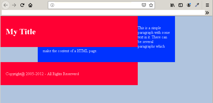
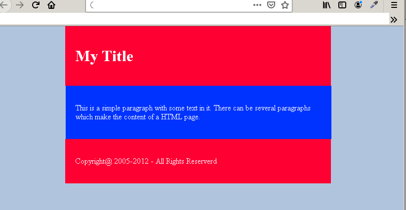
In the example above, there are three boxes – header, content and footer– and each of them are block elements. When the header is floated left the entire flow of the document is disrupted.To bring back the normal flow each element that is floated must also apply CSS <mark style="background-color:rgba(0, 0, 0, 0);color:#a80f0f" class="has-inline-color">clear</mark>. The <mark style="background-color:rgba(0, 0, 0, 0);color:#b80a0a" class="has-inline-color">clear </mark>property has following values:
<mark style="background-color:rgba(0, 0, 0, 0);color:#ca1919" class="has-inline-color">clear:left</mark><mark style="background-color:rgba(0, 0, 0, 0);color:#a81818" class="has-inline-color">clear:right</mark><mark style="background-color:rgba(0, 0, 0, 0);color:#b41010" class="has-inline-color">clear:both</mark>
As you can see that we can apply CSS clear as per our requirement. But to restore the normal flow, you may like to apply the clear: both because we do not want any element on both right or left of the HTML element.The clear must be applied to elements that comes after the floated element only.
  #header,#footer {
       background:#ff0033;
       color:white;
       float:left;
       margin-left:18.5%;
       }
  #content {
       background:#0033ff;
       color:white;
       clear:both;
       }
Output: After applying Clear: Both
You only need to adjust the width, margin, and height of the elements.
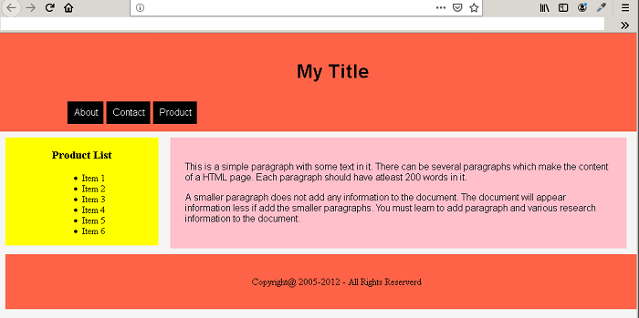
Example Page Layout using Float and Clear
<!DOCTPE html>
<html>
<head>
     <title>Affect of CSS float on HTML document flow</title>
     <meta charset="utf-8">
     <style>
          body{
               padding:0;
	       margin:0;
	       background: Whitesmoke;
             }
          #header {
               width:100%;
               padding:25px;
               margin:auto;
               text-align:center;
               background:tomato;
               color:#000;
               font-family:helvetica, sans-serif;
             }
          #header.h1 {
               font-size: 40px;
             }
          #navigation ul {
               list-style-type:none;
	       padding:10px;
	       margin-left:7%;
	       text-align:center;
	       }
          #navigation li{
               float:left;
	       margin-left:5px;
	       padding:10px;
               background:black;
	       color:white;
              }
          #navigation li:hover {
               background:red;
               }
          #content {
               width:67%;
               padding:25px;
               margin:10px;
               font-size:16px;
               color:#000;
               font-family:helvetica, sans-serif;
               background:pink;
               float:left;
              }
          #sidebar {
               width:24%;
	       background:yellow;
	       color:#000;
	       text-align:center;
	       margin:10px;
	       padding:0;
	       float:left;
             }
          #footer {
               width:100%;
               padding:2%;
               margin:10px;
               color:#000;
               background:tomato;
               text-align:center;
               clear:both;
               }
       </style>
       </head>
<body>
  <div id="header">
      <h1>My Title</h1>
	  <nav id="navigation" >
	      <ul>
		<li>About</li>
		<li>Contact</li>
		<li>Product</li>
	     </ul>
          </nav>
  </div>
  <div id="sidebar">
  <header><h3>Product List</h3></header>
     <ul>
	    <li>Item 1</li>
	    <li>Item 2</li>
	    <li>Item 3</li>
	    <li>Item 4</li>
	    <li>Item 5</li>
	    <li>Item 6</li>
	 </ul>
  </div>
  <div id="content">
       <p>This is a simple paragraph with some text in it. There can be several paragraphs which
  make the content of a HTML page. Each paragraph should have at-least 200 words in it. </p>
       <p>A smaller paragraph does not add any information to the document. The document will appear information
  less if add the smaller paragraphs. You must learn to add paragraph and various research information to the document.</p>
  </div>
  <div id="footer">
       <p>Copyright@ 2005-2012 - All Rights Reserverd </p>
  </div>
 </body>
 </html>
Output In Browser