Table of Contents
CSS float and clear are two important property that sometimes help in creating layouts with CSS. While position property take an element out of normal flow and position it relatively or absolutely in HTML document. It is interesting that CSS float will not take the element out of normal flow, but align either – left side or right side of its containing block..
Syntax
If you want to use CSS float property, use the following syntax.
selector_name {
   float : value; /* values are none, left , right, inline-start and inline-end /*
Here is an example;
div {
float: left;
}
In the above code, the float property is set to left for a div element. As a result, the div element will float to left side of the container, in which it exist still in the normal HTML flow.. If there is no container for floating element, the default container is HTML body.
The float property takes five values and some global values, about which I will write a separate article.
float : none;
float : left;
float : right;
float : inline-left;
float : inline-right;
float: left;
If you have two or more element, then float will stack them to the right of each previous floating element. The following example should make this clear for you.
<!DOCTYPE html>
<html lang="en">
<head>
<meta charset="UTF-8">
<meta name="viewport" content="width=device-width, initial-scale=1.0">
<title>Stacking Elements to Right</title>
<style>
.container{
background-color: blanchedalmond;
float:left;
}
.box1{
background-color: rgb(230, 80, 26);
width:200px;
height:300px;
float: left;
}
.box2{
background-color: greenyellow;
width: 200px;
height: 300px;;
float:left;
}
.box3{
background-color: rgb(47, 129, 236);
width: 200px;
height: 300px;;
float:left;
}
.container > *
{
display: flex;
justify-content: center;
align-items: center;
}
p{
font-size: 45px;
}
</style>
</head>
<body>
<div class="container">
<div class="box1">
<p>1</p>
</div>
<div class="box2">
<p>2</p>
</div>
<div class="box3">
<p>3</p>
</div>
</div>
</body>
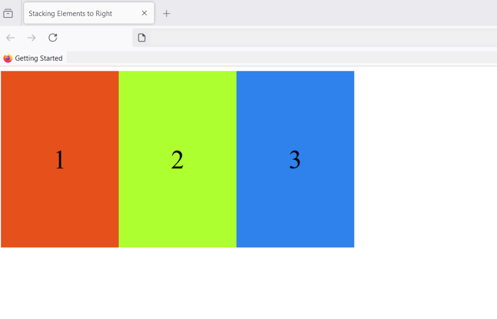
</html>In the above example, we have created 3 boxes with different colors. The container is floating left relative to HTML body. All boxes are floating left and stacked right of previous block, while still remaining in the normal flow of HTML.
Note that <div> element used to create this boxes are block level element , their widths are reduced to 200px and float works. If the elements take full 100% of the width, there will not be enough space to float the elements.
What happens if the number of boxes are greater than the width of the container?
If the number of boxes are greater than the width of the container, the boxes wraps and start from the next line.
<!DOCTYPE html>
<html lang="en">
<head>
    <meta charset="UTF-8">
    <meta name="viewport" content="width=device-width, initial-scale=1.0">
    <title>Stacking Elements to Right</title>
    <style>
        .container{
            background-color: blanchedalmond;
          float:left;

        }
        .box{

            width:200px;
            height:300px;
            float: left;
        }

        .container > *
        {
            display: flex;
            justify-content: center;
            align-items: center;
        }
        p{
            font-size: 45px;
        }
        .box1{
            background-color: red;
        }
        .box2{
            background-color: cyan;
        }
        .box3{
            background-color: lightgreen;
        }
        .box4{
            background-color: orange;
        }
        .box5{
            background-color: yellow;
        }
        .box6{
            background-color:pink;
        }
        .box7{
            background-color: violet;
        }
        .box8{
            background-color:brown;
        }
        .box9{
            background-color: steelblue;
        }
    </style>
</head>
<body>
    <div class="container">
         <div class=" box box1">
            <p>1</p>
         </div>
         <div class="box box2">
            <p>2</p>
         </div>
         <div class="box box3">
            <p>3</p>
         </div>
         <div class="box box4">
            <p>4</p>
         </div>
         <div class="box box5">
            <p>5</p>
         </div>
         <div class="box box6">
            <p>6</p>
         </div>
         <div class="box box7">
            <p>7</p>
         </div>
         <div class="box box8">
            <p>8</p>
         </div>
         <div class="box box9">
            <p>9</p>
         </div>
    </div>

</body>
</html>
In the code above, we created 9 boxes with different colors and once, the number of boxes exceed width of the containing block, it starts in a new line. Following image shows how boxes are stacked.
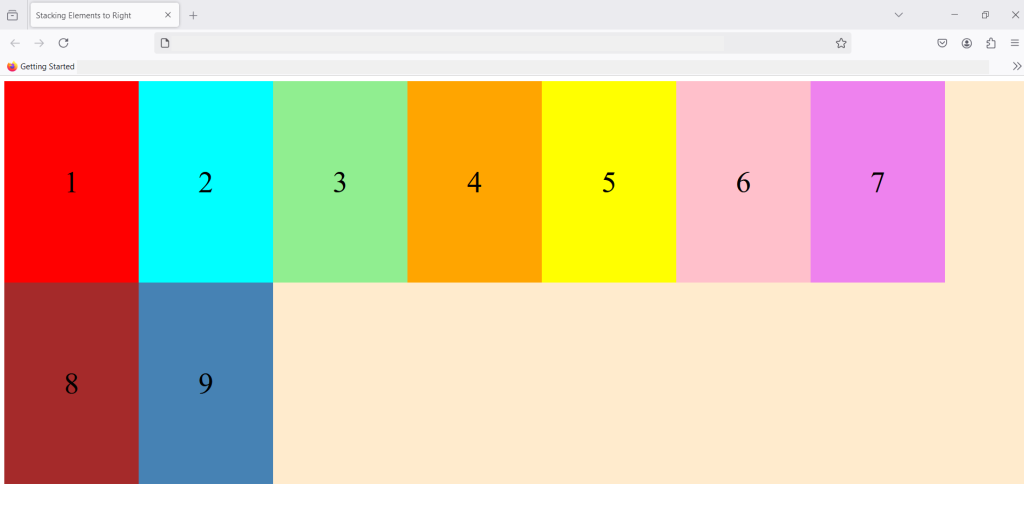
With multiple elements stacked from the second row, it still follow the HTML normal flow and floating left. The elements continue to stack on the right of the previous element.
float: right;
The float : right; works similar to float: left; and move the elements to right , thus stacking multiple elements on left side while maintaining the HTML flow. Consider an example code;
<!DOCTYPE html>
<html lang="en">
<head>
<meta charset="UTF-8">
<meta name="viewport" content="width=device-width, initial-scale=1.0">
<title>Stacking Elements to Right</title>
<style>
.container{
background-color:beige;
float:right;
}
.box{
width:200px;
height:300px;
float: left;
}
.container > *
{
display: flex;
justify-content: center;
align-items: center;
}
p{
font-size: 35px;
color: white;
}
.box1{
background-color: red;
}
.box2{
background-color: blue;
}
.box3{
background-color: green;
}
.box4{
background-color: magenta
}
</style>
</head>
<body>
<div class="container">
<div class=" box box1">
<p>RED</p>
</div>
<div class="box box2">
<p>BLUE</p>
</div>
<div class="box box3">
<p>GREEN</p>
</div>
<div class="box box4">
<p>MAGENTA</p>
</div>
</div>
</body>
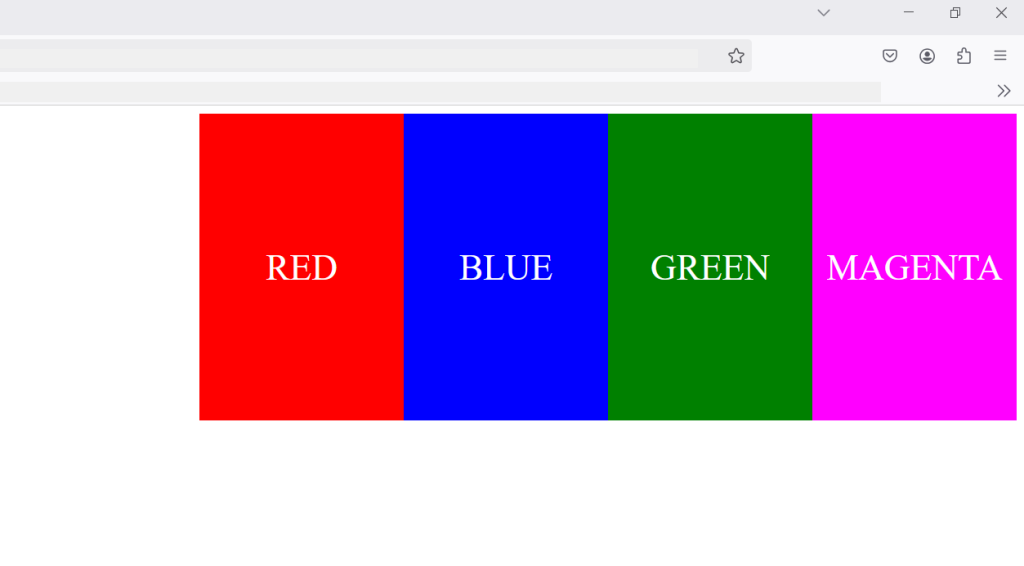
</html>In the above code, I have created 4 boxes and floated them right, as a result they all stacked up to the left. So, stacking always happen in the opposite direction of floating elements.
float : inline-start;
The inline-start value let the element float to start of it’s container element. The element is floated to the start of the container block according to text direction of the container. If the container direction: rtl; means right-to-left , inline-start will align the box to the right corner, that is, inline-start, because the text starts from right.
If the container text direction is direction:ltr; means left-to-right , the inline-start is left corner of the container. Here is a small example to help you understand this better.
<!DOCTYPE html>
<html lang="en">
<head>
<meta charset="UTF-8">
<meta name="viewport" content="width=device-width, initial-scale=1.0">
<title>Float-Inline-Start</title>
<style>
.container1, .container2{
border: 1px solid black;
width: 50%;
direction: ltr;
padding: 10px;
}
.box1{
float:inline-start;
width: 100px;
height: 100px;
background-color: yellow;
padding: 10px;
margin:10px;
}
.box2{
float:left;
width: 100px;
height: 100px;
background-color:red;
padding: 10px;
margin:10px;
}
</style>
</head>
<body>
<div class="container">
<div class="container1">
<div class="box1">
</div>
Lorem ipsum dolor sit amet consectetur adipisicing elit. Eius veniam, asperiores ad ut cum quo, minus deserunt iste laboriosam omnis repudiandae necessitatibus accusantium voluptas, veritatis aperiam reiciendis pariatur! Veritatis, alias? Lorem ipsum dolor sit amet consectetur adipisicing elit. Odio consequatur fugiat obcaecati illo minima, expedita possimus nobis officiis quasi dicta ducimus ipsum laboriosam voluptas magni perferendis reprehenderit natus enim Lorem ipsum dolor sit, amet consectetur adipisicing elit. Culpa dolores commodi expedita non, consequatur eum alias, fugiat dolorem fugit quae ipsum sunt rerum laboriosam nisi, consequuntur temporibus reiciendis sequi repellendus.
</div>
<div class="container2">
<div class="box2">
</div>
Lorem ipsum dolor sit amet consectetur, adipisicing elit. Modi, quasi voluptatum officia, repellat perferendis nam consectetur enim explicabo saepe nobis ducimus molestias facere, at hic. Ullam aperiam incidunt voluptatem. Lorem ipsum dolor sit amet consectetur adipisicing elit. Nulla quos, corrupti odio ad dignissimos vero illum distinctio laudantium sint vel facere ipsam, tempora in fuga assumenda consequuntur aperiam accusamus repellat?
Lorem ipsum dolor sit amet consectetur adipisicing elit. Ipsum ullam dicta doloremque, praesentium sed sint error? Consequuntur voluptatem amet cupiditate iusto culpa explicabo debitis tempora! Veritatis sed eos officia nam!</div>
</div>
</body>
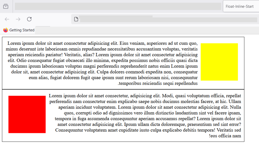
</html>In the example code, we have created two containers – container1 and container2. Each of these containers have box1 and box2 respectively. The direction for containers is set to direction:ltr; (left-to-right).
Here is the output on browser.
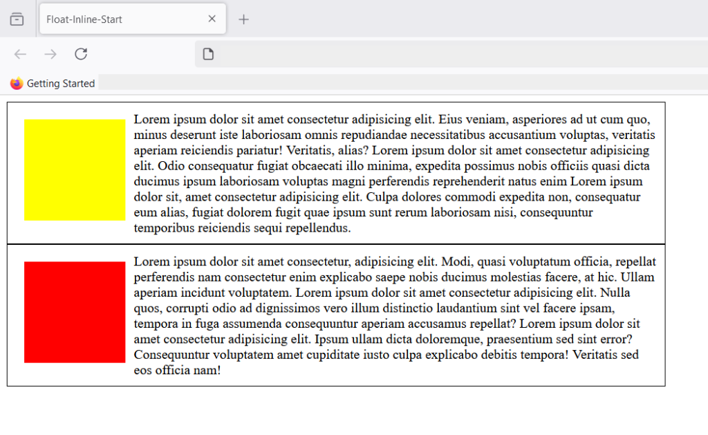
If you see both containers have similar looking output. The yellow and the red box is floating left. So, what’s the difference between float:left; and float: inline-start. To understand the difference, let’s change the direction property to right-to-left.
 .container1, .container2{

           border: 1px solid black;
           width: 50%;
           direction: rtl;
           padding: 10px;
        }
If you save , your changes and view the output in browser. You get following result.
The box1 has shifted according to the direction of text, which is right-to-left now. However, this text direction has no effect on float: left. In other words, only, float: inline-start follows the direction of text inside it’s container.
float: inline-end;
This follows the end of the direction of text for element inside it’s container. It container text direction is set to left – to -right (ltr). The element inside the container with float: inline-end; value will float towards the end (right), because text starts from left and ends towards right.
See the example below.
<!DOCTYPE html>
<html lang="en">
<head>
    <meta charset="UTF-8">
    <meta name="viewport" content="width=device-width, initial-scale=1.0">
    <title>Float-Inline-End</title>
    <style>

        .container{

           border: 1px solid black;
           width: 50%;
           direction: ltr;
           padding: 10px;
        }
.box{
    float:inline-end;
    width: 100px;
    height: 100px;
    background-color: yellow;
    padding: 10px;
    margin:10px;
}

    </style>

</head>
<body>
    <div class="container">

         <div class="box">

         </div>
           Lorem ipsum dolor sit amet consectetur adipisicing elit. Eius veniam, asperiores ad ut cum quo, minus deserunt iste laboriosam omnis repudiandae necessitatibus accusantium voluptas, veritatis aperiam reiciendis pariatur! Veritatis, alias? Lorem ipsum dolor sit amet consectetur adipisicing elit. Odio consequatur fugiat obcaecati illo minima, expedita possimus nobis officiis quasi dicta ducimus ipsum laboriosam voluptas magni perferendis reprehenderit natus enim Lorem ipsum dolor sit, amet consectetur adipisicing elit. Culpa dolores commodi expedita non, consequatur eum alias, fugiat dolorem fugit quae ipsum sunt rerum laboriosam nisi, consequuntur temporibus reiciendis sequi repellendus.
        </div>


</body>
</html>
The text direction is left-to-right in the above example and the box is set to float: inline-end;. You will get following output in the browser.
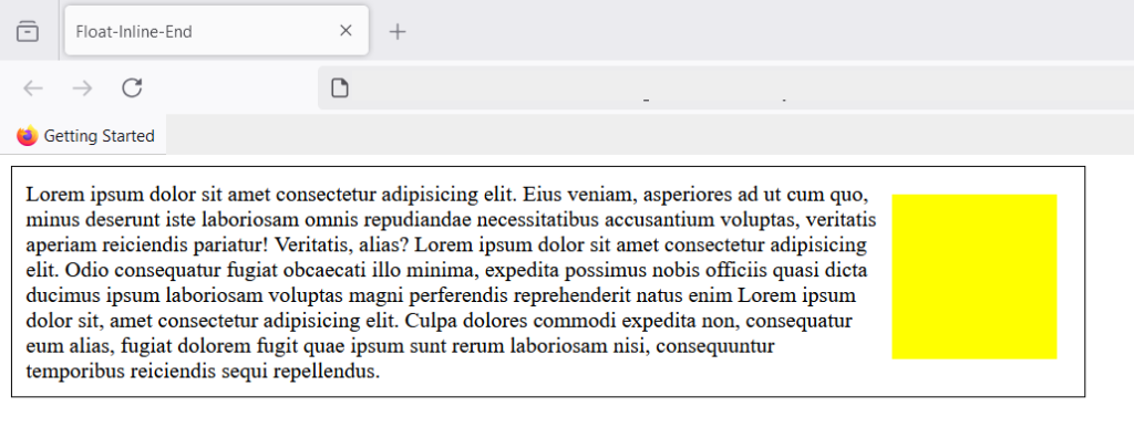
The container has a text direction set to left-to-right and since, end is towards right, the element is floating right.
Summary
To summarize what you learned, CSS float does not take element out of normal flow, but float an element left or right relative to it’s containing element. There are 4 well-known values that float property takes – left, right, inline-start, and inline-end. There are other properties directly related to float such as clear, about which you will learn in a separate article.