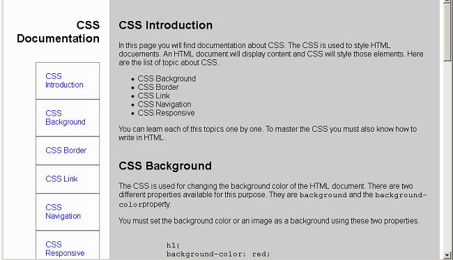
In this article, you will learn to create an HTML page for technical documentation. The technical documents usually have two columns and left or right columns have links to other section of the main document or another page. The links in the sidebar when clicked will open in a section of the document.
Program Code: Technical Document
<!DOCTYPE html>
<html>
<head>
  <title>Project-4: Technical Documentation</title>
  <style>
 #main-doc{
       display:flex;
	   width:100%:
	   font-family:arial, sans-serif;
	   font-size:16px;
     }
	 #main-body
	{
	    display:flex;
		flex-direction:column;
	    width:75%;
		padding:20px;
		align-self:flex-start;
		background:#cccccc;
		font-family:arial, sans-serif;
	   font-size:16px;
	   }
    #navbar{
        padding:20px;
		width:20%;
		display:flex;
		flex-direction:column;
		background:#fcfcfc;
		font-family:helvetica,arial, sans-serif;
	    font-size:16px;
		}
	 #navbar ul li{
	   list-style-type:none;
	   padding:20px;
	   border:1px solid gray;
	}
	#navbar header h1{
	   text-align:right;
	}
	#navbar a{
	  text-decoration:none;
	  }
	/* MOBILE Layout */
	@media(max-width:400px)
	{
	#main-body{
	 background:cyan;
	 }
	 }
  </style>
</head>
<body>
<main id="main-doc">
<nav id="navbar">
<header>
  <h1>CSS Documentation</h1>
  </header>
  <ul>
  <li><a href="#css_introduction" class="nav-link">CSS Introduction</a></li>
  <li><a href="#css_background" class="nav-link">CSS Background</a></li>
  <li><a href="#css_border" class="nav-link">CSS Border</a></li>
  <li><a href="#css_link" class="nav-link">CSS Link</a></li>
  <li><a href="#css_navigation" class="nav-link">CSS Navigation</a></li>
  <li><a href="#css_responsive" class="nav-link">CSS Responsive</a></li>
  </ul>
</nav>
<section id="main-body">
  <section class="main-section" id="css_introduction">
      <header>
	  <h2>CSS Introduction</h2>
	  </header>
	  <article>
	  <p>In this page you will find documentation about CSS. The CSS is used to style HTML docuements. An HTML document
	  will display content and CSS will style those elements. Here are the list of topic about CSS.
	  </p>
	  <ul>
	    <li>CSS Background</li>
		<li>CSS Border</li>
		<li>CSS Link</li>
		<li>CSS Navigation</li>
		<li>CSS Responsive</li>
	  </ul>
	  <p>You can learn each of this topics one by one. To master the CSS you must also know how to write in HTML.</p>
	  </article>
  </section>

  <section class="main-section" id="css_background">
  <header>
	  <h2>CSS Background</h2>
	  </header>
	  <article>
	  <p>The CSS is used for changing the background color of the HTML document.
	  There are two different properties available for this purpose. They are
	  <code>background</code> and the <code>background-color</code>property.</p>
	  <p>You must set the background color or an image as a background using these two properties.</p>
	  <pre><code>
	  h1{
	  background-color: red;
	  }
	  </code></pre>
	  <p>The example for background property. The background gives option to add images or other elements as background.</p>
	  <pre><code>
	    body{
		background: url('/back-img.gif');
		}
	  </code></pre>
	  </article>
  </section>
  <br>
  <section class="main-section" id="css_border">
        <header>
	  <h2>CSS Border</h2>
	  </header>
	  <article>
	  <p>The CSS border put a border around HTML elements. There are different style for each border. But you can use solid border which
	  is the default border.</p>
	  <p>Here is an example of CSS border.</p>
	  <pre><code>
	  div {
	     border-top: 300px;
		 border-right:200px;
		 border-bottom:300px;
		 border-left:200px;
		 border-style:solid;
		 border-color: black;
		}
	  </code></pre>
	  <p>The above is the long version of setting borders. The shorthand version is given below.</p>
	  <pre><code>
	   div {
	     border: 2px solid black;
		 }
	  </code></pre>
	  </article>
  </section>
  <section class="main-section" id="css_link">
      <header>
	  <h2>CSS Link</h2>
	  </header>
	  <article>
	  <p>In html, you can create links that will take you to another html page. The CSS link properties will decorate links in many ways.
	  The links can have background, color and other css properties modied through CSS. Consider the following example.</p>
	  <pre>
	  <code>
	     a {
		    color:red;
			background:black;
			}
	  </code>
	  </pre>
	  <p>Sometimes you can use the link pseudo classes to manipulate links to simulate a behaviour.
	  For example <code>:hover</code> is a class that will change the link once user hover their mouse over the link.</p>
	  <pre><code>
	      a:hover {
		     background:red;
			 color: white;
			 }
	  </code>
	  </pre>
	  </article>
  </section>
  <section class="main-section" id="css_navigation">
       <header>
	  <h2>CSS Navigation</h2>
	  </header>
	  <article>
	  <p>One popular use of CSS is creation of navigation links. You can create a vertical or a horizontal navigation link.
	  The link and list element of html together with css create beautiful navigations.</p>
	  <p>When you click on the navigation it will take to same page but different location, or different external website.</p>
	 </article>
  </section>
  <section class="main-section" id="css_responsive">
       <header>
	  <h2>CSS Responsive</h2>
	  </header>
	  <article>
	  <p>The CSS flexbox and CSS grid are two popular method to create a responsive website. The responsive web site will always change its
	  layout and design according to the device viewport.</p>
	  <p>You can create a mobile ready site with media queries and flex or grid layout. The size of the screen will apply a different CSS.
	  Therefore, your page will appear differently on different devices.</p>
	  </article>
  </section>
  </section>
</main>
</body>
</html>
Output: Technical Document
The technical document is responsive in nature. Once you have written the code and saved as an HTML document. Open the page in a browser and try to make it as smaller as possible. You will see the layout of the page changing and that’s because we have include a mobile only CSS called<mark style="background-color:rgba(0, 0, 0, 0);color:#b51919" class="has-inline-color"> @media</mark> (media queries).
